Showing posts with label Artful Journeys. Show all posts

Saturday, December 12, 2015

Artful Journeys - Week #50 "Let it Snow"

I love winter, and I love cold weather. Unfortunately, here in north Texas this is not something we get an over-abundance of to enjoy.  In fact, it was 76 degrees here on Friday, the sun was shining brightly in a beautiful, clear sky. It was more like a lovely spring day than the early onset of winter.  Weather in Texas is fickle.  Hot one day, raining the next, or we could have surprise hail, high winds, tornadoes, and yes...occasionally the rare snow fall -- but not usually until late January or early February, if at all. 

What we usually get in winter here is ICE. It rains. Temperatures plummet to below freezing overnight, sometimes as much as a 50 degree swing from the daytime.  The next morning -- disaster, but usually a holiday for everyone.  We build all our roadways here for heat -- not winter's kind of nasty precipitation.  So if it's white, hard or not, we get out in it. We play in it. We walk in it, we rejoice in the gift of winter in it's rarest and most magical form.  Roads close, schools close.  A free day is enjoyed by most everyone, because we cannot drive in it, seriously.  I'm not taking that risk.  All the Yanks that moved down here think we're crazy. They drive in it. They wreck. They go home. And play in it. 

Now I know you friends who live wayyyyy up there in the northern reaches surely have a more realistic and pragmatic approach to winter.  You can. You have the equipment to remove it, stack it, plow it, shovel it, dig out from under it. You know how to drive in it.  Nobody I know owns a snow shovel.  Who needs it?  Because by noon, any fun white stuff is usually gone and the temperatures have changed drastically.  We have mowed our lawn the week of Christmas and after that as well. 

So, if you get too much snow this winter, send us some.  But in the meantime, I'll be giggling while I'm still wearing short pants and flip flops as we open our Christmas gifts and think of you having a beautiful, white Christmas.  Keep all the hard white stuff.  Just send the fluffy, fun stuff, please.

Hopefully, you find some level of fun or inspiration with my spread this week.  I liked doing something different this year for you, and with a fun color palette.  I created the background with acrylics and vintage papers and then did an overlay with PicMonkey to finish off the spread.

Best wishes, and here's hoping all your holiday preparations are going well!

ARTY AUNTIE
~Betty

Friday, November 27, 2015

Artful Journeys - Week #48 Prompt "Hang A Wreath"


This week at Artful Journeys, we asked our members to "Hang a Wreath" in their art journals.  As usual, I wanted to be a bit different and was not thinking about "Christmas" just yet, with Thanksgiving just being barely over.  Fall is still in full swing here in north Texas, and it won't officially be winter for a while, so I didn't want to rush anything.


My initial idea was to create a 'kaleidoscope' of color, and I began by creating a wheel of fall colors with acrylics in red, orange and yellows, banded in a wheel.  I had these wonderful fall looking silk (or polyester?) leaves that I thought would be perfect. So I took out my trusty compass, drew a big circle and began to layer the leaves.  I had just enough to do a double row.  But after they were applied, the kaleidoscope really wasn't all that visible. 

Initially, I had hand lettered the quote, but must have had a brain phart right at the end, because the word "enough" was not spaced out right and looked totally stupid.  Out came the gesso, more paint, more dabbing and brushing, and lots of use of the heat gun.


I decided to pull out some new-to-me lettering stamps I bought recently and stamped out the quote on some bristol paper, cut to size and affixed with Helmar 450 Quick Dry Adhesive. This stuff is the bomb!  Really sticky, dries fast and clear and is the best general purpose adhesive I have ever used!


This spread didn't seem to need much else because to me, it was already starting to look kind of fussy with all those leaves, so I just added some doodly framing around the quote and called it good.

Below are a few other things I have been working on the last week or so. It was so nice of you to stop by for a look, and as always, if you'd care to leave me a comment on anything I've posted here, it would be greatly appreciated!


Vintage newspaper collage spread
Vintage newspaper advertising

Dylusions Spray Inks with acrylics and Stencil Girl Stencil

Dylusions spray inks and Stencil Girl stencil

Dylusions spray ink, blending tool, mop up inks and Stencil Girl stencil

Acrylics, Art doll by Annmarie Killam, stencil

Just trying to add more and make it into something!

Planner pages in the Hobonichi or "Fauxbonichi" style


Grumpy Cat "You'd be angry too if you had to wear this ugly-assed collar all day!"

4x6 index card - Repeating Word, Doodles

Artist Trading Card Swap - Crazy Birds

Impromptu Art Challenge

Thanks again for stopping by!  Remember, keep it artful!

ARTY AUNTIE
~~Betty


Saturday, November 14, 2015

Artful Journeys - Week #46 "Empty The Pantry"

This week at Artful Journeys we asked everyone to get creative with a bag, box or label from something in their pantry, using it in a creative way in their journals.

Naturally, I picked something associated with coffee.  There are 18 loose K-cups laying on my kitchen counter right now. Seems as though I have either used or pitched out every coffee box I thought I had...I have recently been purging and re-organizing my art space and it's not like I won't get more.  <grin>

In my honest opinion, I think that mixed media artists are some of the best people at reusing, recycling, upcycling and turning trash into treasure. I took this opportunity to do some of the same for this prompt, using some of the mountains of great stuff I have saved and have been sent by my generous art friends.  I started with the Eight O'Clock Coffee box of k-cups and began mulling over what I wanted to do while cutting the box apart.  I then cut up a really nice cardboard envelope that I received in the mail containing some stencils I ordered, prepped the backside with gesso and paint, rolled on with my soft foam brayer, using 3 colors of craft acrylic: Violet Pansy, Lavender and Diva Pink.  The gesso left bits of white showing through and I loved it!  It was messy, but in an orderly sort of way.  I cut it to 9x"x12" to fit into my Artful Journeys mixed media journal.

 Many of you know that I can add layers and layers of paint with no problems whatsoever. What I wrestle with the most is adding bits of paper and ephemera.  The concept of "JAM" -- just add more -- really doesn't work with my high sense of order and my compulsion to make everything in my life and art world the same...orderly! But I'm really working on that specific compulsion with my art.  I love, LOVE the grunge or JAM styles, but have trouble "just adding more."  So I dug out my paper ephemera container and started pulling things that spoke to me as to color, texture, re-useability.  I used a reprint of art given to me and made by Annmarie Killam, a bit of leftover painted paper received in happy mail, the inside of a Starbucks coffee sleeve, a scrap of a punch cut, some monopoly pieces and started arranging and playing.  Using my Signo Uniball 207 pen, I made some random marks on the background.  More playing around with placement of my "bits"; I fussy cut out the dolly image from Annmarie's artwork (thank you, Annmarie!) 

I decided the coffee box was too garish, so I applied some gesso with my hands and zapped it dry with the heat gun.  I am impatient, too!  When dry, I then outlined some of the letters with my Signo Uniball pen. Loved how the white gesso changed the whole look of that piece of box.


Now, time for glue and final placement.  I have recently discovered Tombow Multi Mono Liquid Glue (found it on sale at Wal Mart of all places) and this stuff is truly amazing.  It has a pen tip and a wide tip and is super-duper sticky and is quite versatile.  The packaging says you can adhere and then remove if you apply and let it dry thoroughly before attaching to something. For use as a permanent fixative, just apply and adhere to your base while wet. I'm going to test this "removeability" feature on some unmounted stamps and see how that works with my acrylic blocks.  The glue dries clear and is acid free and photo safe.  And the best part?  A little bit goes a long, long way!
So I got all my bits and pieces glued down and zapped again with the heat gun...the impatience thing again! 

I pulled out my Caran D'Ache NeoColor II water soluble crayons and used the turquoise, blue and back to add highlights to some of the bits and just smudged them with my fingers and some more outlining and doodly bits with the Signo Uniball pen.


One last bit of fiddling and I pronounced it finished.  This was a lot of fun, and for me, this was a good challenge, making art that was a little less orderly and "neat" and a whole lot of "just adding more.  I hope you like what I created!


Wishing each of you a wonderful week.  We know many are already beginning their Thanksgiving holiday preparations ... big cooking takes time!  But as always, make some time in each day to keep it artful!

Hugs and great art,
ARTY AUNTIE
~Betty


Saturday, September 26, 2015

Artful Journeys - Week #39 "Tea Time"

Tea Time... really?  And they (the other girls) are saying this to a die-hard coffee fiend?  Yes, they insisted.  Nobody griped about the prompt.  Except for my private, quiet gritching.  I made something snarky first, but thought.......nahhh.  Better not go there.  But it's in my journal.  Tea?  pfffffffft.  But in the spirit of going along and getting along, I pulled my mind out of the gutter and started over.  And my mind went straight to Alice in Wonderland.  I love that book. I love all the original drawings by John Tenniel.  I love everything about it.  So off I went.

I found the original drawings by Tenniel online and blew up the tea party scene and printed it out on 8.5" x 11" glossy photo paper.  I dragged out all my alcohol inks and a new packet of aqua brushes and my spritzer bottle of rubbing alcohol and got busy.  Oh what fun this was.  Not exactly like "coloring" and not exactly like "painting".  The alcohol ink goes on really smoothly on the photo paper and blends really nicely with a little dip of the tip in alcohol.  Whatever it was in the end, it was great, and I like how it turned out.  While working on this, I recalled this wonderful story and now I have a big smile on my face and the gritching is all gone.  Quote on a shaving foam background on 140 lb cold press watercolor paper with a bold Signo Uniball for the lettering.

Yes, Alice, we are ALL mad here.......


I hope you like what I did this week.  It surely put a smile on my face.  Be sure and go see the fun over on Melody and Shana's blogs, and as always, visit Artful Chicks to see Lynn's.

Have a very artful week, y'all.
~~Betty aka Arty Auntie

Sunday, September 20, 2015

ARTFUL JOURNEYS - WEEK #38

We're thinking about fall this week, although it is still a long way off for us here in North Texas.  We don't have tons of trees that turn beautiful colors.  What we do have is continued hot weather and a drought, so leaves have been falling here all summer, and turning a crunchy, dead brown.  But those of you living where you have beautiful maples and birch trees and others that turn gorgeous shades during the fall, I am sure some of you are already enjoying nature's artful display.

Folks like myself have to create the beauty of autumnal leaves with the bold, warm colors of fall.  And that's exactly what I've done for myself.  I love "fall" in North Texas, although it is extremely short.  Our weather is most predictable during this time of year, we have cool evenings and moderate temperatures during the day.  This is when we go outside to play and work and enjoy a respite from the heat.

For my journal spread, I scraped on some Liquitex Basics in Raw Umber and enhanced with some Dylusions Spray ink in Melted Chocolate.  I used this fantastic advertisement for M&M's candies I saw in one of my new magazines.  If you look closely, you can see that someone has taken an inordinate amount of time and created those fun leaves wholly out of M&M's.  The minute I saw it, I knew I would be using it somehow, and today was the day.

I used some "found" letters to create the word "AUTUMN" down the left margin, and added the words with a Sakura Gelly pen in white.  All my white Signo Uniball pens with the bold tip are out of ink (more online retail therapy needed), so this was going to have to do today.  I added some loose silk fall leaves for additional interest.  The verse was something I was inspired by that I saw on Google.

The verse reads:
A lways catches me off guard 
U nwanted though it is not 
T rees turning color   
U topian weather  
M y favorite season   
N ever lasts long enough


So wherever you are, and wherever you may roam, I hope that you are able to enjoy the splendor of the autumnal art that Mother Nature will be displaying.

Make it a great week!

ARTY AUNTIE
~~Betty

Monday, September 14, 2015

Artful Journeys, Week #37 "Let's Go to the Fair"

Fair season is here!  Yay!!   I love going to the fair, thinking about the fair, eating my way around the fair.  And yes, I love the exhibits and all the sights and sounds that make up the great State Fair of Texas.


The State Fair of Texas began in 1886 and has continued annually except for a few missing years during WWI and WWII.  It generally always starts the last Friday in September and runs for 24 days. During the run of the fair, there are over 2.5 million visitors, making it one of the highest attended fairs in the world.  The 80 acre grounds at historic Fair Park houses one of the greatest collections of art deco buildings in the world, that have been renovated to their full 1936 visual glory. Many are still undergoing structural renovations.  Fair Park houses the grand Hall of State, several museums, the aquarium, the State Fair Music Hall, Starplex and other attractions.  Many special events are held on the grounds throughout the year and Fair Park has undergone many changes, renovations and upgrades throughout the years.  The first Red River Rivaly (Texas-OU game) took place in 1929.


The Texas Star at night


We had the proud distinction of installing the largest ferris wheel in North America in 1985, known as the Texas Star. It is 212 feet tall, weighs in at 678,554 pounds, at an initial cost of $2.2 million dollars (Things are always bigger and better in Texas, aren't they?) Sadly, the Star of Puebla in Mexico installed in 2013 stands at 250 feet.


The fair hasn't gone by all these years without a few catastrophes, including the collapse of the gondolas (Swiss Sky Ride) in 1979 causing its total removal, several ride incidents, the removal in 1989 of the Texas Comet Roller Coaster that had been in place since 1947.

Debut of Big Tex, 1952
Fire - October 12, 2012

The biggest and saddest catastrophe of all was the fire that destroyed our beloved Big Tex on October 19, 2012. Texans loved and totally identified with Big Tex, who started his life as a big wire framed Santa Claus, but transformed to Big Tex in 1952 and was and still is a fixture at the entrance to the Midway.  Big Tex is a common meeting place to rendevous with friends and family and I would hazard to guess 100's of thousands of photographs have been taken there.


As a child, we couldn't wait until "fair day."  Admission tickets were (and still are) given to all school age children in the state to attend the annual State Fair of Texas.  My mother would take us, with picnic basket in hand.  Back in the day, buying a lot of fair food was just not economically feasible for my mother, but she labored diligently every year making a great picnic of fried chicken and all the trimmings. We would almost always have lunch on the grounds of the Hall of State building that is regal and currently houses a significant amount of historical artifacts for the State of Texas.  How she lugged around that heavy basket all day, in a dress, with heels on, I will never know. Thank goodness I never had to do that.

After joining the band in 7th grade, fair trips were always on the band bus until I graduated from high school. We played concerts at the Hall of State, and we always very disappointed if our time was scheduled for late in the day. We wanted to be one of the first bands to perform in the mornings so we could have the entire day to have fun with our friends.  Bands always marched in the Twilight Parade each evening, bringing a close to a long day of fun and merriment.

I have missed very few State Fairs in my lifetime.  When I was living overseas, and a few years here and there.  When my brother was working the parade with the Scottish Rite band, we would go every day and schedule our visits to exhibits throughout the entire run of the fair.  And our first stop was ALWAYS to the Fletcher Corny Dog stand.  Seems like nowadays, we are planning our visits around the grounds based on what food we want to try next.  And there is always something new and exciting to try.  Dieting during the fair is not an option.  Most everything we want, and we get, is your basic heart attack on a plate.  But it is so worth it.

What I did for my spread this week is based on my fondest memories of the fair.  The food, the rides, the exhibits, The Hall of State.  I tried making a spread all in black and white and shades of gray, but it just wasn't working for me.  So I gathered together some favorite vintage and new photographs and prepared this digital collage, that I have printed and added to my Canson mixed media journal. The background started as a vintage 1960's postcard that has been modified and of course added to and enhanced with some of my favorite fair images.


I hope you like what I prepared and that you will hop on over to see what Melody and Shana made this week too.

Here's hoping you get to go to a fair near you this fall.  I'm definitely making my annual sojourn to the Great State Fair of Texas in just a few short days.  The anticipation is killing me!

As always, keep it artful!

ARTY AUNTIE
~~Betty

Saturday, August 29, 2015

ARTFUL JOURNEYS - WEEK #35 "Sunsets & Fireflies"

Our prompt this week at Artful Journeys is Sunsets and Fireflies.  What could be better for the end of the summer?

As we were coming home from dinner on Friday evening, we had a spectacular sunset!  There was apparently a lot of dust in the upper atmosphere and the sun, a huge crimson orb, cast off shadows of deep purples, pinks and blues and bright, golden linings to the clouds behind the setting sun.  It went down quickly, but the sight of it, and its still-lingering memory inspired my spread this week.


This page was done with heavy body and craft acrylics, with the idea of the sun setting over the hills around our lake.  My fireflies are mostly captured in little mason jars, drawn with a white Sakura Pen Touch pen.  The glow of the fireflies is with a neon yellow Sharpie paint marker.

I hope you like it.  No quote this week or words of inspiration.  Just the sheer joy of remembering how we used to catch fireflies in mason jars on hot summer nights as kids, and sometimes pinching off those blinking tails and smearing them on our shirts.  Fun times!

Have a wonderful and artful week!

ARTY AUNTIE
~Betty

Sunday, August 23, 2015

ARTFUL JOURNEYS - WEEK #34

"Art is the window to man's soul. Without it, he would never be able to see beyond his immediate world; nor could he see the man within."  ~~Lady Bird Johnson


 This week at Artful Journeys, our prompt is "WINDOWS."

I went with a literal interpretation this week, but on a more basic level.  My original idea was to make something very complicated, and about a third of the way through it, I hated it and into the big square file under my desk it went. <sigh>

After that, I just couldn't make up my mind.  Collage some windows?  Have eyes peeping in or out? Use a commercial window envelope?  Draw some windows in a big city?  I started the latter, hated that one too and covered it up with lots of gesso, and turned the page again.

Next, my old friend, Pinterest.  Nothing hit me.  I went to my closet hidey hole and pulled out a big stack of children's coloring books.  I found a cute image of a window with a cat playing, but THAT basic idea hit me.


I used the window itself as my inspiration and replicated it as best as my drawing skills would allow. I found it wasn't THAT difficult.  A window by itself is really just a box.  And I liked the simplicity of just using a plain, simple window with a powerful message as a reminder to make me think.

So, I sketched out the window and used Copic markers, Sakura Glaze pens, Signo Uniball pens in bold and micro tips, along with a Deep Red brick stamp.  I used a barn red acrylic craft paint that I applied with a paper towel and a baby wipe over the stamped brick.

I have a whole journal of collected quotes and sayings.  I try to jot them down when a great one presents itself and selected the one I used because I find it very introspective in nature, as I do the quote I started this post with by Lady Bird Johnson.  Yes, we can look out the windows, but what if we looked "inward" to the window of our soul a little more often?  Imagine the discoveries we shall find there!

Be sure and check out what Melody, Shana and Lynn created by visiting our group blog, ARTFUL CHICKS and leave us some love!  I'll be watching over at Artful Journeys for all your wonderful takes on this very interesting prompt challenge.

Have a great week, and remember to keep it artful!

~~Betty
ARTY AUNTIE


Sunday, August 16, 2015

Artful Journeys - Week #33 "Bad Poetry"

What a week this has been.  I had a big spurt of creativity following a busy week with errands, grown up stuff and some real work.  It has been so hot here this past week, we are all suffering, and trying to hide out inside as much as we can. But thankfully, the last couple of days we have not broken 100 degrees F.  Our version of a cold front.  But I digress...

This week at Artful Journeys, our prompt for you is to create a spread using "Bad Poetry".  The concept of this prompt is to generally select a central image and then find random words or phrases (or let the image dictate your selection of words) in magazines, cut them out and include them on your spread.  You can go wild with this. It isn't supposed to make a whole lot of sense, but you would be amazed at how your mind works and puts words and phrases together that make sense on your spread.


My spread actually started with the cartoon image I had saved from a Geico advertisement. Then, while sifting through my box of clipped images, the clock showed up and I knew (why?) that this is what I wanted to work with.  I pulled out my box of found words, deciding on the above.

I worked really hard on this page.  I have always had trouble with the JAM philosophy (just add more) for fear of really messing up my hard work.  But this time, it created some magic for me!  Hooray!


I started the spread in my 9x12 Canson mixed media journal that I started at the beginning of the year and only has about 15 pages left before it is full!

I began by gluing down some dictionary pages that I tore all the margin edges off and fitted them to the page and affixed with gel medium.  I then tore some sheet music and placed them randomly across the page. Then, I added some random flower and leaf punch cuts on the page. The color didn't matter since I knew paint was going on top of them, and this would help to create texture on the page.

Next, I spritzed Dylusions Inks in Fresh Squeezed Orange and Funky Fuscia, followed by sealing with some hairspray, knowing I would be adding more wet media! (Dylusions Inks reactivate when wet).  I added some Bright Magenta & Spice Orange fluid acrylic on top of that with a baby wipe, and some Dylusions Acrylic in Sunshine Yellow with a credit card, blending as I went.

I was satisfied with the color of the background and moved on to stenciling.  The clock stencil is by Fab Stencils and it was applied with a watered down Titanium White acrylic with a cosmetic sponge, dipped and the dabbed off the excess onto my mop up paper.  I then added the square stencil, and added some black into the white to create a tonal gray and stenciled a little bit more for some darker contrast.

Now to play with my clippings.  I wanted that cartoon Muppet to be hanging off that clock, and that was a chore. I ended up having to work to fit him around that clock, glued him to the back and then affixed the whole thing to page with gel medium.  Sadly, I accidentally scraped across the clock and Muppet and distorted the image a little bit.  Words affixed to the page and outlined with a black china marker.

I am rather pleased with how it turned out.  The "poetry" is really bad, but somehow the whole thing works together.

Hopefully this gives you a little jolt of inspiration for your spread!

Have a great week!
Arty Auntie
~~Betty

Saturday, August 1, 2015

ARTFUL JOURNEYS WEEK #31 - GO ORGANIC


Our prompt this week at Artful Journeys is to "go organic."  Our original line of thinking was to use real organic materials but I just wasn't feeling it at first and I think my Muse has perhaps gone on holiday. And besides all that, everything in my yard is getting brown and crispy. It is our hottest time of the year and I am no gardener.  For heaven's sakes, I can kill silk plants!

So, I created this first spread Friday night after my weekly dinner date with the hubs. I had wandered around in the yard and just couldn't seem to find anything I felt like was suitable that was growing, er.... dying.


I sat down with my Dylusions journal and let the page just happen "organically".  We've had a bit of a stressful week, and friends and friendships are definitely on the forefront of my mind and how important those relationships are.  So this little idea started in the back of my head.


I started by stamping across the bottom with my large Dylusions curly-q stamp (not sure what the official name of it is, but I love that stamp!)  Then I used a large tree stencil and applied lightweight spackling through the stencil and let it dry.  In hindsight, I should have finished the background colors first, but oh well, right?  I then used a small flat brush and applied some Liquitex acrylic in a light brown to the trunk and limbs.  I used a large foam sun stamp in the corner and filled the page with Liquitex Cadmium Yellow Deep Hue and added some embellishments with the light sepia.  I then proceeded to use some Dylusions Distress ink in Orange to make some dots all over the tree. I liked how that was going, so I opened up a Quin Magenta and a Neon Pink and made some more random dots on the tree using my index finger.  So freeing to paint with our hands, isn't it?


I also applied other random dots in the lower margin and using some Spring green, added leaves and stems everywhere.  I tried a couple of different techniques coloring in the curly-q's at the bottom, including a baby wipe (epic fail), finger painting (fail) Dylusions Inks - sprayed (fail) and NeoColor II's.  Obviously I had much more control with the NeoColors and will likely be making some use of some gesso later and redoing the bottom part.  But for now it just has to do.

My favorite part is the tree.  I will we had "feel-a-vision".  I love the way the lightweight spackle works through a stencil.  Something so fun about feeling that texture.

Lettering with a 0 fine liner brush and black acrylic paint.  My friends are the flowers in my life. And I'm so glad you're planted where you are.

Then this morning, Saturday, I got to worrying about not really following along with the prompt in a closer sort of fashion. I went outside with my coffee to the front porch and stood there looking around.  Would my neighbor mind if I went and snagged some stuff from her flower beds?  Probably. My poor flower beds are pitiful. Dry. Dying. Tired looking.  I went to the back deck. Had a look through the garden -- which is barely hanging on. Nothing good there. The Basil looks good, but I was definitely uninspired by that.

Back to the front.  We have this stand of 100+ foot Sycamore trees across the front of our yard. The leaves are generally HUGE.  Time for a closer inspection.  Oh, look!  Some baby leaves...... that could work.  And Sycamore tree leaves have an interesting shape -- so I selected several and returned to my dining table and fixed a fresh cup of my favorite elixir.

Turn the page in the Dylusions journal.  I picked up my Dylusions acrylic tubs in Turquoise and Bubblegum Pink and added paint all over everywhere.  I added some stamps.  Hated all that. Out comes the gesso. Same colors, different application this time with a brush and some babywipes.  That worked better.


I was sent this great face image on deli paper in happy mail some time back -- sorry I cannot remember who shared it with me.  I grabbed that and played with it on the page, laying the leaves here and there.  I felt like those leaves would make a great "crown" and so I went with that.  Leaves and face image were applied to the page with Faber Castel Gel Medium, and the leaves were given another coat with some DIY Mod Podge.  I had previously used this with another leaf project over a year ago and the leaves are still soft and green.  Nobody wants brown crumply leaves in their journal, right?

I grabbed up some Liquid Pearls in Peacock and a bottle of Scribbles in gold metallic and added the veins and outlined the leaves.  That "crown" needed some sort of edging so with the Scribbles I created the crown base and added jewels there and on the tips of the leaves. She looks pretty good, huh?  The flash on my camera made the deli paper show up more, but in natural light, it just seems to blend in perfectly.

Those big Sycamore trees were still in my mind. More digging through happy mail and I found these beautiful papers sent to me by Kay Theuerkauf in Australia.  I lettered a "thought" on these two papers with a black Sakura Gelly pen, adhered to the page with Gel Medium and added the Queen Elizabeth Australian stamp just for fun. Out lined with a black china marker.

In case you can't read it --

"As she sat in the shade of the old Sycamore tree, she fashioned herself a crown.  She felt like Queen of the Earth.  And it was so."

The last leaf I picked was added to the corner of the page and tarted up like the crown.  And lastly, I grabbed some Liquitex Neon Green and a small circle stencil and added some additional paint and called it good.

And here is the finished spread.  More in tune with what we originally had in mind.  I feel better about it.  It was fun playing with those leaves after all.  Did I noodge my Muse to wakefulness?


Thanks for stopping by, and have an artful week.  Be sure and show us how you interpret our prompt this week, and don't forget to stop by and see what Melody, Shana and Lynn have created!

ARTY AUNTIE
~~Betty


Saturday, June 20, 2015

ARTFUL JOURNEYS - WEEK #25

Oh what fun an artful, creative and glorious messy day I had playing with inks and shaving cream! Reminded me so much of the day I finally got my Gelli plate.  I thought I would run out of paper before I ran out of steam for having fun!

This week at Artful Journeys we want you to play with shaving cream to create fun and interesting background pages for your journals, notecards, ATC's or whatever you want to use the papers for.

After doing a significant amount of research on Pinterest about nearly every method of using shaving cream and "paint" -- I decided on a method for me.

THE BASICS:  You will need a can of cheap shaving cream ($1 at Dollar Store); a jelly roll pan or cookie sheet with sides; a straight edge (like a ruler*), sturdy cardstock, Bristol or watercolor paper and some paper towels.   You can use stationery, but it will curl due to the thinness of the paper.  Bring in lots of paper. You will want to keep doing this it is so much fun!

THE COLORING PART:  You can use many, many things to "color" your shaving foam to include: food coloring liquid, food coloring gels, alcohol inks, stamp pad ink refills (liquid), acrylic paint, & liquid watercolors to name a few.  For my experiments, I used some Stampin' Up liquid ink refills.  I have a shoebox full of them I got from my friend's estate -- so this was a perfect opportunity.

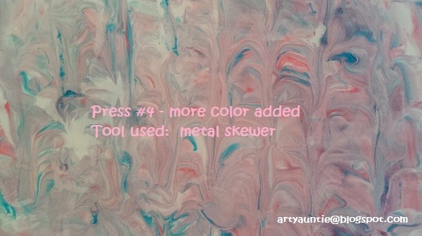
THE "TOOLS" I USED:  Since I was in the kitchen, I opened up my utensil drawer and drew out a long icing blade, a metal skewer, a butter knife, an icing rake, a scalloped-edged biscuit cutter, two sizes of rubber spatulas, a wide metal spatula (my best egg turner!) and a small flat spreader.


PREP:  To do my backgrounds, I went to the kitchen.  I had watched several videos and knew I did NOT want to do this at my art desk. First, not enough room, and secondly, I needed to be able to handle a messy substance.

Clear off space on your kitchen counter.  Beside the sink is really helpful (or to me, anyway).  Put your cookie sheet out and squirt a goodly amount of shaving cream into the pan so that it will fill the pan to about 1/2" thick and clear to the edges and smooth lightly with the tool of your choice.

Add drips, lines and squiggles of your coloring material.  See above for suggestions.  I used some re-inker inks for mine.

Now, with the tool of your choice, draw lines or swirls until you are satisfied lightly mixing the colors. I got a bit carried away with this bit a time or two and "over mixed" causing too much muddling of the colors at times, but I don't think it makes that much difference.  In the design, perhaps--depends I suppose on how much blending and lines and swirls you want in the final lift. I was playing so I wasn't too picky about the design at this point.


Lay your paper on top of your shaving cream, and press lightly so that all the paper gets covered. Lift carefully off the foam.  You can create different effects by straight lifts, dragging, etc.

If you get big white spaces, just repress onto the foam.

Once you lift it off, you will be scraping off the foam.  This is why I wanted to be at the kitchen sink.  My first press, I used a ruler to scrape off the foam and rinsed it off the ruler in the kitchen sink. I particularly didn't like the scraping method with the ruler, although very effective at getting more of it off all at one time in a big sweeping motion.  So I switched to my big wide spatula.  Once I scraped most of it off, just wipe the edges and across the page with a paper towel to remove any leftover foam.  Lay your page off to the side to dry (it will dry rather quickly).  If it starts curling, roll or curl into the "flat" position, and lay on flat surface. You can always weight it if you need to do so.

Rinsing really made this more pastel in color

This process is so much fun!  Get another piece of stock and play some more.  You can see in my photos, I really played around with this stuff.  I smoothed; didn't smooth; added more color; didn't add more color.

Each lift will be a little bit lighter.  Bored with your first colors, rinse off in the sink, dry your pan and do it all again with a different color palette.


Here is where I changed my color palette as the pink, red and blue was getting rather muddied. I started this set with a bright green and yellow.


After the first press, I added a Kiwi green that turned out to be rather dark, but I ended up liking it a lot. I think I can do a lot with this one.


This next one, I used a wide icing spatula to smooth out the top which blended the greens a little more, but not too much. Use a light hand.  I liked the color blending. It turned more of a soft celery green, with some of all 3 colors peeping out.


For this next press, I added a few more dots of that kiwi color and then used a wide rubber spatula and smoothed the top out again, further blending the colors, then made cross-hatch marks with a bread knife.  Loved how the lift turned out with a softer, more celery-green color, but still showing the white spaces.


And for the last press, I smoothed the top one more time. It was getting rather pale, but I am still in love with the color.  Using a small rubber spatula, I dragged it through the pan, creating peaks and valleys and a few swirls.


This was so much fun...and I could have kept going and going like the Energizer Bunny. It's fast. It's no-brainer easy.  Next time, I am breaking out all my food coloring and food coloring gels and play with those.

I can't wait to make some fun journal pages with these marbelized papers. I think the backgrounds will be awesome.

Keep it artful everyday!

ARTY AUNTIE
~~Betty