That's a pretty powerful statement "Magical things happen when you keep trying..." isn't it?
I
made some magic of my own this week, and not without practice, I can
assure you. While I am not a super-skilled artist, the one thing I do
have is tenacity to keep at something until I either get the hang of it
or the "lightbulb" finally comes on. As I age, I seem to get fewer and
fewer lightbulb moments, so when I do get one, an extraordinary sense of
accomplishment fills my soul!
Those of you that know
me and my art know that "grungy" is not something I am known for, or can
(could) even do with even a small sense of satisfaction. Being a
Virgo, and with OCD and a compelling sense of order takes control of my
art most of the time. Line things up. Crisp lines. A clear picture or
image. Fear of messing up a piece I've worked hard on drives me more
than just adding more. When it comes to paint, I can slap on layers and
layers of the stuff without any problem. Adding ephemera and the total
finish out, well, that sometimes is another issue for me entirely.
The significant magical happenings for me this week: I made grunge, and I made it more than once! whoop! whoop!
My grungy pieces are part of a workshop currently hosted by Tammy Garcia at Daisy Yellow called
Novel Approach,
where we are altering a book and exploring and working with heavy body
acrylics and more grungy type work. If you are interested in checking
out this terrific workshop, click
HERE.

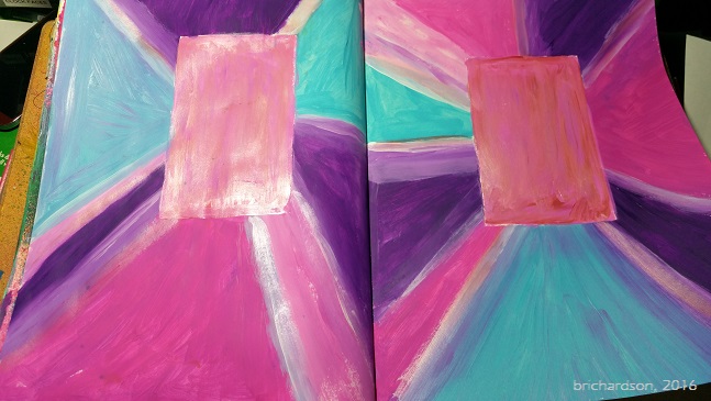
One of our first "assignments" was to create a prism or starburst page,
using and blending heavy body acrylics. This was my first page. I
shared it with the group, but truthfully, there was not one single thing
I liked about it except the process.
Then,
not wanting to let this thing beat me, I made a second page, this time
with a little different approach and color choices. This was page #2. I
didn't have the suggested Golden Iridescent Pearl paint, so I opted to
experiment, instead, and used a soft pink Liquid Pearls and painted it
on the journaling blocks and some of the lines. Still wasn't loving
it. It was still "too" -- too bold, too bright, too "even" or
something. I liked it better than the first one, but not in love with
it. Only the process made me happy.
So off I went again,
on attempt #3. I began to alter the above spread by adding some black
Neocolor II and a lovely stencil by Traci Bautista from StencilGirl.
I rather liked how this looked, but then I went and added more.
<sigh> Here's where I get into trouble. Now, I'm out of love
with this one again.
I
don't like my lettering (with Posca pen) and while I love this girl, I
don't like her on this spread at all. Me thinks the gesso will be
coming out again to cover this one up. Still have to either work
through the ugly on this one, or start over. I decided not to decide I
was so frustrated and have let it sit.
Again, I
mustered up another go, brought out the gesso and slapped it over effort
#1, covering up all that bright, garish ugly. We don't have to live
with something we hate in our journals. That's the beauty part about art
journaling. After letting that nasty thing sit for a day or two, I
couldn't stand it any longer. I didn't want it in my Happy Journal,
because primarily it didn't make me happy. At all.
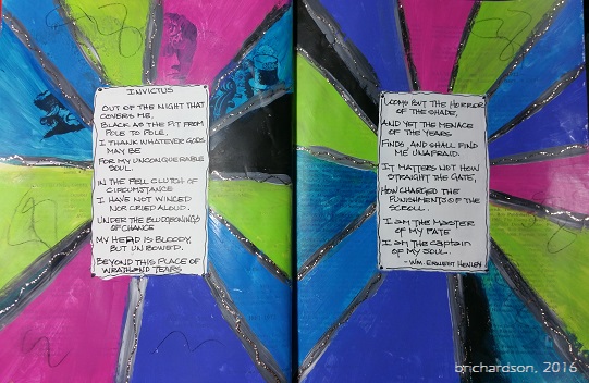
So
this time, I chose a darker palette to work with. I used Dina Wakely's
heavy body acrylics in Night, Lapis and Lime. I blended with titanium
white and the only brush work was the last little bit around the
journaling boxes. To me, this LOOKS grungy. It isn't perfect. You see
the movement in the paint, the old one underneath adds a bit of
dimension to it. Overall, I was very happy with this version. I still
don't have anything in the journaling boxes, and might not ever put
anything there, but at least I managed to accomplish the concept.
So,
off I went to tackle the next grungy assignment. Oh boy. I got to
paint more with my fingers and had no brushes to try and clean up
afterwards. This time, we were making a background page. Gotta love
those. Here's my first one:
This
is definitely NOT grungy. I got so carried away having fun blending the
colors with my fingers, I ended up with something a whole lot more
Monet-esque and a whole lot less on the grungy side of things. To me,
this background screams spring, butterflies and flowers, sidewalk cafes.
Definitely not grunge.
So what did I do? Out came the black NeoColor II for a few smears.
Wasn't liking that all that much, so then I grabbed <hold on> ...
black charcoal. Where each paint color separation happened, I outlined
the area, then smudged. Wow, what fun was that!! This stuff smears
great. Your fingers get super nasty, but oh what fun this was! This
definitely ended up super grungy. I sealed the charcoal with a spray fixative, not knowing what might come later. There is still nothing else on this page,
but I think I can definitely see something kind of steampunk-y or Teesha
Moore style happening ultimately on this page. Definitely doesn't look springy any more!

You know how I am -- I still wasn't satisfied or finished playing in all that glorious,
yummy paint, so I made another background page. It's all abstract and
funky and schmeary and was super fun. I'm letting it rest a few days to
see where I want to take it. Because I was a little more heavy handed
with my paints this time, not too much of the graffiti-style markings
underneath with NeoColors didn't show through all that much, but I can still see a lot
of the altered book through the paint, and I like that part. It's bold
and dark at the same time, and that kind of contrast really speaks to
me.

So
this next page, is more grungy in style and manner of application,
using NeoColors and medium only, with only a teeny weeny bit of paint
right at the last. Of course I didn't exactly follow the rules or
guidelines that Tammy set out, but I still was happy with the end
result. It looks grungy. It appears random, although the process wasn't
random at all (more of my OCD kicked in). At the very end, I used my
Stabilo All pencil and added some additional marks to my page, just
because I could. This is a huge breakthrough for me. Just for fun.
Just for play. Just because. I liked it!
So, by the time I finish this fun workshop with Tammy, I might just
master the art of grunge. Who knows. I'm kicking my OCD, order-loving
inner critic to the curb. I'm covering up stuff I hate, and doing my
best to create something that makes me happy. In my happy journal.
Life is good. Go out and keep your world artful.
ARTY AUNTIE
~Betty

 This week at Fauxbonichi Journalers, we were given the challenge to create a "tangled" dimensional tip in for our journals or planners. I thought this was a fun and different challenge, so I tackled it with some late-night gusto (as usual).
 Following that, using a medium tipped Faber Castell Pitt pen, I outlined the body and began doing my limited tangles in the center portion of the wings and elsewhere. Switched off to a white Uniball Signo UM-153 pen in white and added the rest. I painted the head, body and antennae with black heavy body acrylics. As you can see, my doodles are just kind of random doodly marks. I just was going for the basic idea here, not creating a masterpiece by any stretch of the imagination.