Showing posts with label Acrylic paint. Show all posts

Saturday, August 29, 2015

ARTFUL JOURNEYS - WEEK #35 "Sunsets & Fireflies"

Our prompt this week at Artful Journeys is Sunsets and Fireflies.  What could be better for the end of the summer?

As we were coming home from dinner on Friday evening, we had a spectacular sunset!  There was apparently a lot of dust in the upper atmosphere and the sun, a huge crimson orb, cast off shadows of deep purples, pinks and blues and bright, golden linings to the clouds behind the setting sun.  It went down quickly, but the sight of it, and its still-lingering memory inspired my spread this week.


This page was done with heavy body and craft acrylics, with the idea of the sun setting over the hills around our lake.  My fireflies are mostly captured in little mason jars, drawn with a white Sakura Pen Touch pen.  The glow of the fireflies is with a neon yellow Sharpie paint marker.

I hope you like it.  No quote this week or words of inspiration.  Just the sheer joy of remembering how we used to catch fireflies in mason jars on hot summer nights as kids, and sometimes pinching off those blinking tails and smearing them on our shirts.  Fun times!

Have a wonderful and artful week!

ARTY AUNTIE
~Betty

Sunday, August 16, 2015

Artful Journeys - Week #33 "Bad Poetry"

What a week this has been.  I had a big spurt of creativity following a busy week with errands, grown up stuff and some real work.  It has been so hot here this past week, we are all suffering, and trying to hide out inside as much as we can. But thankfully, the last couple of days we have not broken 100 degrees F.  Our version of a cold front.  But I digress...

This week at Artful Journeys, our prompt for you is to create a spread using "Bad Poetry".  The concept of this prompt is to generally select a central image and then find random words or phrases (or let the image dictate your selection of words) in magazines, cut them out and include them on your spread.  You can go wild with this. It isn't supposed to make a whole lot of sense, but you would be amazed at how your mind works and puts words and phrases together that make sense on your spread.


My spread actually started with the cartoon image I had saved from a Geico advertisement. Then, while sifting through my box of clipped images, the clock showed up and I knew (why?) that this is what I wanted to work with.  I pulled out my box of found words, deciding on the above.

I worked really hard on this page.  I have always had trouble with the JAM philosophy (just add more) for fear of really messing up my hard work.  But this time, it created some magic for me!  Hooray!


I started the spread in my 9x12 Canson mixed media journal that I started at the beginning of the year and only has about 15 pages left before it is full!

I began by gluing down some dictionary pages that I tore all the margin edges off and fitted them to the page and affixed with gel medium.  I then tore some sheet music and placed them randomly across the page. Then, I added some random flower and leaf punch cuts on the page. The color didn't matter since I knew paint was going on top of them, and this would help to create texture on the page.

Next, I spritzed Dylusions Inks in Fresh Squeezed Orange and Funky Fuscia, followed by sealing with some hairspray, knowing I would be adding more wet media! (Dylusions Inks reactivate when wet).  I added some Bright Magenta & Spice Orange fluid acrylic on top of that with a baby wipe, and some Dylusions Acrylic in Sunshine Yellow with a credit card, blending as I went.

I was satisfied with the color of the background and moved on to stenciling.  The clock stencil is by Fab Stencils and it was applied with a watered down Titanium White acrylic with a cosmetic sponge, dipped and the dabbed off the excess onto my mop up paper.  I then added the square stencil, and added some black into the white to create a tonal gray and stenciled a little bit more for some darker contrast.

Now to play with my clippings.  I wanted that cartoon Muppet to be hanging off that clock, and that was a chore. I ended up having to work to fit him around that clock, glued him to the back and then affixed the whole thing to page with gel medium.  Sadly, I accidentally scraped across the clock and Muppet and distorted the image a little bit.  Words affixed to the page and outlined with a black china marker.

I am rather pleased with how it turned out.  The "poetry" is really bad, but somehow the whole thing works together.

Hopefully this gives you a little jolt of inspiration for your spread!

Have a great week!
Arty Auntie
~~Betty

Monday, June 29, 2015

Artful Journeys Week #26

Our theme for our prompt this week is patriotism / red, white & blue and what a glorious way to memorialize our nation's independence this week.

I am a very proud American.  I well with pride at the singing of our national anthem.  I weep for those who have died serving our country and protecting our freedom.  My ancestors have served in every war protecting our freedom and independence, and of that fact I am most proud.


Created in my Dylusions journal, I prepped the blue field by braying on a dark blue acrylic craft paint and applied portions of a flag-themed paper napkin for the stars with gel medium.  I used flag red for the stripes and added the reproduction post card with the Statue of Liberty, one of our nation's most iconic symbols of freedom.  I finished by incorporating the lyrics from God Bless the USA by Lee Greenwood with a bold Signo Uniball pen.

I hope you like what I created this week.  Take a moment this coming weekend during your holiday celebrations to reflect on the reasons we celebrate this national holiday and all the sacrifices that have been made for our freedom, and for those still being made to keep us safe and enjoying the liberties we so enjoy.

LET FREEDOM RING!

Arty Auntie
~~Betty

Saturday, June 13, 2015

Artful Journeys - Week #24 "Sail Away"

This week at Artful Journeys our prompt for you is "SAIL AWAY"


I drew inspiration from an old song from 1979 by Christopher Cross called "Sailing". This has always been one of my favorite songs and can "take me away," even if just for a two minute song.

Created in my 9x12 Canson mixed media journal, I used acrylics, NeoColor II's and watercolor for the background. Lettering with a bold Signo Uniball pen.  The sailboat was created entirely out out Washi tape, created on an old envelope and then cut out and applied to the page.

So sail away to your happy place, even if just for the time it takes you to make your journal page.

I'm doing my best to keep it artful this week!

ARTY AUNTIE
~~Betty

Saturday, March 14, 2015

ARTFUL JOURNEYS - WEEK #11 "Color it Green"

Gosh, so difficult for me to make anything green, to wear green or to think green when everything is still pretty much brown and boring outside, not to mention super muddy. But thankfully we are getting much needed rain!  The weeds in my yard are green, and they are growing very well, thank you.  But it is too wet to mow. LOL

Our prompt at Artful Journeys this week is kind of a multi-parter:  Color it Green and use a brown paper bag or Saran Wrap.  


I have known about this prompt for months. Cogitated on it. Still nothing. Then today, when I was out doing my grown up thing, I started thinking about how cloudy and overcast it was, but oh! there! The wild sand plum bushes are blooming and oh, look! Over there, the Bradford Pears are blooming too.  Sunshine in the dreary gray sky.  That was it, my inspiration for this week's prompt.

I did take a couple of pictures of these early blooms for you.  Aren't we lucky?  Spring starts early, leaves early. So I take great pleasure in seeing the Jonquils popping up and all the early flowering trees showing us their "stuff" as Mother Nature shakes off the grips of winter.


I watch this patch of sand plums like a hawk, because the plums will be ready to pick in mid to late June, but I have to hurry or the dang deer and the birds get most of them.  They make the best jam you've ever tasted!

And here are some lovely Bradford Pear trees lining one of my neighbor's driveways.  In a couple of weeks, (barring no hail or high winds) these trees will be stunningly beautiful, but the blooms are short lived.


Okay, I have digressed, I know.  So let's get on with it now that I have shown you my inspiration.


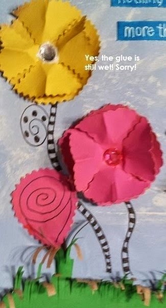
My spread is created in my Canson Mixed Media Journal.  Background created with Apple Barrel craft acrylic in Sky Blue and Antique White.  I brushed on the blue and used a damp paper towel to smudge on and smooth out the Antique White creating a cloud effect.  I added a lightly primed large sun stamp to the top corner, hoping to give the effect of the sun trying to peek through all these clouds.


Then, in lieu of cutting up a big brown paper grocery bag (which I only had one and am saving), I dug out a roll of heavy duty brown kraft paper.  Using Dina Wakely's heavy body acrylics in Ruby, Turquoise, Magenta, Lemon, Tangerine & Cut Grass.  I painted some wide stripes on the paper, blasted with the heat gun and then cut into strips.

I then used straight and fancy edged scissors to cut out some circles of assorted sizes; some of which I "stripped" and "curled".  I formed these circles into flowers, added embellishments voila!  Flowers.

I cut a double strip of the green and cut a few hundred slashes onto one side.  I cut off about 1-1/4" and curled into like a tube to form a flower "base.  I cut some other ovals to make some "roses"


Assorted fancy edge scissors used


Lettering strips are 1/2" watercolor paper, colored with Peacock Blue Copic marker and lettered with White Signo Uniball


And the finished spread.  I was rather pleased with the finished outcome, giving me a little sunshine on these cloudy, rainy days.  And I did make good use of the green, right?  This way really way out of my comfort zone.  Nobody said the whole thing had to be green.....and y'all know I'm a rebel. So there.  (hehehe)


So go out there and do something outside YOUR comfort zone and be adventuresome.    Then be sure and show us your creations over at Artful Journeys!

* * * * * * * * * * * 

Here are some other things I have created recently that you may not have seen.


These ATC's were done for the prompt " Find Circles"


These ATC's were done for a prompt called "Button Day"


This is an ATC done for an Alphabet series of swaps we have going on now.  Lace was "dyed" with copic marker.


 These ATC's were for a collaboration project.  Tamie Wilson did the backgrounds, Shelly Recicar added the mesh and paper & wooden flower; and I added the sunflower girls and the saying.  This was a very fun project with a great team!


Easter-themed mail art swap with the prompt:  Easter Eggs.  The card on the right is "napkin" art that has been embellished and was included in the swap as some 'extra" love to my partners.


This is my final copy of another ATC collaboration project.  I did the background, CJ Messa added the adorable fish, rock (?) and brown sandy parts & washi, and Annmarie Killam added the bubbles and shell charms.  This was a great swap and the entire team did an awesome job!


This was made as a freestanding art piece on watercolor paper as a mail art swap. Our prompt was "HeART" art swap with Dylusions Inks, Dylusions blendable acrylics, stencils, washi, punch cuts, Staz-On stamp pad ink in Tuxedo Black and Adirondack Stamp pad ink in Stained glass.


I don't know if I showed you this one already or not, but I like how it turned out so much I'm showing it off again.  This was for a journal page swap with the prompt "Gratitude" and went to the multi-talented Delores Miller.  Dylusions spray inks, stained french lace, Vintage lady from The Graphics Fairy, colored with NeoColor II.


This is a tri-fold tip-in for my journal I prepared for last week's prompt at Artful Journeys. Made on an upcycled K-cups box; Dylusions blendable acrylics, vintage images from Pinterest; magazine clippings and a silhouette sent to me in happy mail.

So that's what I've been up to lately.  Thanks for stopping by and having a look.

Go out there, stay creative and as always, keep it artful!

~~Betty


Sunday, February 15, 2015

Artful Journeys - Week # 7 Mardi Gras

LAISSEZ LES BON TEMPS ROULETTE!  

We're going to let the good times roll (translation) for upcoming Mardi Gras (Fat Tuesday) and in celebration of Carnivale.  Nothing is off limits, everything goes, be wild, be gaudy and have fun. That's what Mardi Gras is all about!

I have been to many Mardi Gras celebrations throughout the south during my lifetime, and of course the most raucous celebration here in the states I think happens in good ole 'Nawlins.  That would be New Or-leens to you folks living north of the Red River and the Mason-Dixon line. LOL.  I have a sizeable collection of beads, and many coveted King beads that I will neither admit nor deny to participating in debauchery to obtain.  What happens in "Nawlins" stays in "Nawlins."  And of course, that was a long, long time ago in my much younger (and wilder) days.  We don't talk about that now.

For this week's prompt at Artful Journeys, I prepared two very different things.  The first, a spread in my large Dylusions journal using assorted techniques and materials.  I scraped on a background of craft acrylic in Spring Green, Parakeet and Caterpillar.  Then I applied a thin coat of a heavy metallic gold acrylic paint that is super glittery.   While wet, I used my Soft Swirls background stamp by Stampin' Up to imprint some of the design into the paint.  Some of the paint lifted, but that's okay.  I knew I wasn't creating something to be "perfect" anyway.

I knew I wanted to somehow emulate the sensory overload that you go on when you attend a Mardi Gras celebration.  Especially in New Orleans.  Music is everywhere. Lights. Costumes. Confetti. Beads. Glitter. Wafting smells of food drifting out of restaurants and bistros into the streets.  Bazillions of people of every imaginable description, in every conceivable state of sobriety or intoxication.   To me, the entire city comes alive during Mardi Gras.


So I drew a kind of "explosion" spewing forth from the center, representing of course, the French Quarter, where all the fun happens and branching out all over the city and into the 'burbs.  I painted the bottom of this explosion with Purple Monster and Parakeet craft paint, several thin coats to get a deeper sense of the color.  Then I highlighted with a gold Signo Uniball pen.  Bits of "confetti" and music are represented by doodles, again with a black Signo Uniball pen and the confetti filled in with assorted acrylic paints.

I lettered "Laissez les bon temps roulette" (Let the good times roll) with Signo Uniball pens in black and white.

And here is the finished page.  The glittery parts really shine, and of course play havoc when trying to photograph under less-than-ideal circumstances in my kitchen, and at night.  I hope you enjoy it and that it brings a smile to you!


My second thing I made sits opposite the above page in my Dylusions journal on a similarly colored background, with Laissez les bon temps roulette, Mardi Gras & Fat Tuesday  written all around the edge of the page with black Signo Uniball pen.

I created a Mardi Gras mask!  I cut a mask template that I found online (here).  I don't have the exact link since I saved it years ago.  I dug out my big ole bag of decorative feathers and began applying them all over the mask I cut from some cardboard packaging I had saved (imagine that!!). 


 I added some flat jewel stones around the eyes and in the center.  I trimmed up the feathers at the nose area and slightly around the edges.  Always fun to find another creative outlet "just because".  I have many styles and types of Mardi Gras masks over the years, and I have to say working with these feathers is my least favorite. They are fussy. They fly everywhere. They are hard to get to stick down without jacking them up.  But it is another medium, and another thing to play with.  Can't beat that. We just move on to the next thing and will look back and laugh later.


So however you celebrate Mardi Gras, do it in style and with gusto.  You don't have to be of any particular religious persuasion to go out and have some fun.

Stay artful!
~Betty


Saturday, January 31, 2015

Artful Journeys Week #5 - February Calendar

Can  you believe it is February already?  Why is it that when you are a kid, time just drags along and you think tomorrow will never arrive?  And now that I am O.L.D. time just whizzes by like a bullet train.

When I think of February, my heart always gets excited.  February not only is the month of love, the month we honor the American Heart Association by wearing RED, but in north Texas, it also heralds early signs of spring.  Our days are getting warmer (although sporadically), and as we typically enjoy mild winters, this has been one of the mildest I can remember in recent history.  We were in the mid to upper 70s all week this week.  The hubs got out and tilled the garden again for the umpteenth time and got our onion sets all planted.  We have to plant early because it gets really HOT here in the summertime.  We can regale you with those stories later!

Almost always, I get a box of one of my favorite chocolates from Russell Stover -- the Raspberry Parfaits or Adelaides. I don't need any heart-shaped boxes of candy.  I like what I like.  ha.  Heaven knows I don't need either. I am fluffy enough already.  It is always nice to have a special day where your loved one shows you some attention and reminds you how much you are loved.  Those special times are to be hung onto and treasured, no matter what day of the year that love comes spewing forth.  And, my Mother's birthday is at the end of the month.  She would be 90 this year.  Is that right?  Wow.  When I stop and think about that, it blows me away.  90.  Such a big number.  She has been gone from us since 2008, and not a day goes by that I don't miss her.  The love has never waned and never will.  If your Mother is still around, give her an extra big hug and kiss and think of me. Tell her how much you love her, appreciate her and thank her for being a great mom.  I would if mine were still here.


But I digress.  You're here to see our prompt this week.  And what fun it was.

Our prompt was to create a February calendar  using red, pink and white (and any other colors that suit your fancy).

SUPPLY LIST:
  • Gesso
  • Liquitex Basics Acrylic - Napthol Crimson
  • Liquitex Basics Acrylic - Medium Magenta
  • Liquitex Basics Acrylic - Brilliant Purple
  • Liquitex Heavy Body Acrylic - Alizarin Crimson
  • Daler-Rowney Simply Acrylic - White
  • Daler-Rowney Simply Acrylic - Brilliant Red
  • Aquatec Acrylic Polymer - Cadmium Red Light
  • Apple Barrel Craft Acrylic - Pink Parfait
  • Apple Barrel Craft Acrylic - Bright Magenta
  • Stampin' Up Hearts & Swirls background stamp
  • Blue jar opener gripper thingy for texture
  • Fiskars Heart Punch (small)
  • Punch cut scrapbook paper letters
  • Bone folder
  • Cosmetic sponge 
  • DIY "Mod Podge"; Elmer's Glue; UHU Glue Stick
  • Assorted glitter stickers 
  • Assorted small rubber stamps 
  • Staz-On Stamp Pad - black 
  • Bold Uniball Signo Pen - white 
  • Bold Uniball Signo Pen - black
  • Sakura Gelly Pen - black


I had fun making this calendar this month.  I love to save cardboard.  Always sturdy. Always fun to alter.  I opened up a saved frozen pizza box and started slapping down some paint with my 6" hard rubber brayer.  Bray this way, then that way.  Add some more paint layers. Do it again.  Let it dry while you go get a fresh cup of coffee.  Come back.  Add some more.  There.


Now--that was looking pretty good.  So I grabbed up my swirly heart background stamp and applied Pink Parfait to the stamp with a cosmetic sponge and stamped and repeated a few times.  I love this method of stamping because I am stamping acrylic on acrylic and get a much better and smoother stamping as opposed to using just stamp pad ink with these large background stamps.

For more textural effect, I grabbed this rubber jar opener thingy and spread some remaining Pink Parfait craft paint on it, and slapped it down on the page here and there, "re-inking" with the paint on my brayer a few times.

Then I thought I had better turn my attention to how I wanted the "month" to appear.  I have all manner and sort of stickers and letters and letter punches.  I tried all various colors laying against the background and decided to go with some black and ivory mixed scrapbooking papers to make the month title pop on the page.  I laid them out, glued them on with some DIY "Mod Podge" (saving my expensive gel medium).  I embellished a few of the letters with my Signo Uniball pens, and outlined the whole thing.


Next, I turned my attention to laying out the calender.  I knew I wanted to leave some journaling space and some "planner" space on the calendar.  Measure the cardboard I just painted against my Canson Mixed Media journal I planned to put it in.  Size was nearly perfect.  I trimmed it to the size I wanted and then spread DIY Podge all over the journal pages and the back of the cardboard and set about affixing it to the journal.  This part took some time and some weighty books since this cardboard wants to curl when it is wet.  More coffee.  A few pinches here and there.  Zap it with the heat gun.  All good.

First a quick peek at a printed February calendar. Great 4 even weeks.  Then I gridded out the squares and used my Bold White Uniball Signo pen and outlined the whole thing.  While the squares are not evenly gridded, they are fine.  I usually don't put much on my calendars on Saturday and Sundays anyway.  And we're not making museum art, right?


I also gridded out the "planner" part of my calendar page on the blank space I had on the left side of the page.  A few fun stamps were added for color and whimsey.  I used 2 different alpha stamp sets for the days of the week and a black Staz-On stamp pad.

Using my small heart punch and some pink cardstock, I punch cut 28 little hearts to use for the days and numbered each of them with a black Sakura Gelly pen and affixed with a small swipe of UHU glue stick.

More.  I am working hard to "just add more" to my work.  Out comes the button box.  There are some cool ones in there, so I added a few of those.  And a nifty little felt heart added to the Valentine's Day square.

Then some glitter stickers with the words "Love" and "Hearts", outlined with the Signo Uniball pen.

A few more doodly things here and there.  Added Mother's birthday, not that I needed reminding -- just because.

And here is the finished spread.  I left plenty of room for me to journal at the bottom as the month wears on and stuff starts to happen.


We have a lot going on in Artful Journeys this month, and I am anxious to see what beautiful creations you come up with for your February calender.

Leave me some blog love if you like.  It always warms my heart to know you are actually reading these posts.

Staying artful!
~~Betty aka Arty Auntie

Saturday, January 24, 2015

Week #4 - Artful Journeys

Wow!  The whole month of January has just flown by!  We are already to week #4 and our prompts this week are:  "Favorite Sports Team" and/or "Under The Sea".

 When we came up with the initial prompt, we were thinking about the Super Bowl, the Pro Bowl and all the fun things that happen with sports in the winter time.

We aren't big sports fans in my house, unless you count the hubs' total fascination with Nascar.  Not my cup of tea (either one).  Now, if the Dallas Cowboys were playing in the Super Bowl, I would so be right in front of the television cheering them on.  But since they literally dropped the ball during championship game, the fizz went out of my brewski.  No fun for me if the hometown team isn't playing, so it is easy to get involved with something else.

I racked my brain for ideas.  No mojo.  I let it rest and went on to something else.  Tick tock. The clock was ticking and time was running short.  So just a short 3 days ago, I struck upon this idea to run with the "no sports" thing.  I finished it last night.  Nothing like waiting to the last minute, right? A deadline is a great motivator!


SUPPLY LIST

  • Liquitex Heavy Body Acrylic Paint - Chromium Oxide Green, Brilliant Yellow Green
  • Craft acrylic paint - White, Bright Yellow, Spring Green, Caterpillar
  • NeoColor II watersoluble crayons - black, cadmium red, dark blue, pink, green, orange, bright yellow
  • Watercolor paint
  • Black China marker
  • Copic Marker in Leather
  • Chipboard letter "N"
  • EK Success 1-1/4" circle punch
  • EK Success small oval punch
  • Sakura Gelly pens in black, red, dark brown & white
  • Bold Uniball Signo pens in Black & White
  • Faber Castell black Calligraphy nib pen
  • Corrugated cardboard as a stencil
  • Green tinted sisal twine
  • Alene's Tacky Glue
  • Credit card for sraping
  • Medium flat sable brush & #4 filbert brush
  • Vintage lady image found on Pinterest


When I initially started the background in greens, I was thinking about turf grass.  If I had it to do over, I might choose another base color. But there it was, and I just kept letting it unfold organically.  I added 3 different greens and scraped them all on this way and that with the edge of a credit card.  Then I added some stencil marks all over it with a dark Pine Needle craft paint with the inside "corrugated" part off a coffee sleeve I salvaged from Starbucks that I just painted with the acrylic paint and stamped away here and there all over the page.  I find tools and inspiration everywhere.....especially when drinking coffee!

I kept looking at that page. Now what?  I knew I had printed off some vintage ladies and began rummaging through my vintage ladies box to find one that suited my mood and attitude. There she was.  I snatched her up, fussy cut her out (she was on slick cardstock).  I used some NeoColor II's to add color highlights to her to make her stand out a little more on the page.  I adhered with Alene's Tacky glue that I spread on very thin, and used the edge of a clean gift card to spread it out and smooth it down.

How to tie in the sports?  I'm not loving this prompt at all and still wasn't much enthused about it.  Then it hit me.....what about some floating balls like my lady was thinking about all those sports and how much she detested them.  So, punch out some circles and an oval.  Baseball, basketball, soccer ball & football.  Researched Google for some images.  I found drawing the soccer ball the hardest of all.  You wouldn't think it would be so difficult until you put that pencil down.  But I managed to get something that sort of resembled a soccer ball.  I chose these because their images are so iconic and easily recognized...as opposed to a ping pong ball or golf ball, which I knew I would never get to look like a real golf ball.  LOL So I got all that going and done and affixed to the page again with Alene's Tacky Glue, smoothing out so there would be no wrinkles.

I didn't like all that dark green, so I mixed up some white and added a dot of Chromium Oxide Green and Brilliant Yellow Green together and brushed it on in broad, loose strokes sort of down the center left of the page.  I needed a place to do some slow journaling.

There.  That was better, but I pretty much covered up all of the corrugated stenciling.  Oh well.  Such is art journaling!

Still boring.  I dipped my finger in some of the leftover mixed-up paint and made some dots around the page with my index finger. Dried with the trusty heat gun.  Remember I am in a hurry now... whipped out the trusty white and black Uniball Signos and went around some of those dots with some circles and made some more.  Better.

What to say?  I wanted whatever she said to be a little snarky, a little sassy and a whole lot of me.  I don't like to sweat.  I am not good at sports that require sweating.  (I do excel at water sports!) So, I just started, thinking of a sweet southern belle sitting on the veranda on a crisp, cool evening sipping a little mint julep.  Ahhhhhh, that is heaven.  So I just started with her talking, "No, sports for me, darlin' -- I don't DO "sweat."   That was pretty snarky and sassy, right?  Can't you just visualize her sipping away and laughing at the boys playing tag football on the lawn??  I surely can.  She tires of watching all that activity and asks "Pass the mint juleps please".  There.  That's it.  That's enough, and it says it all, at least to me.

I had a big blank space left at the bottom so I doodled up some quirky little flowers and colored them in with NeoColor II's to represent her lovely garden, just a step off that veranda.  The smell of blooming flowers wafting in the air against the crisp, cool evening.  Heaven on earth.


Should I doodle a border?  No border?  Paint it?  <sigh>  Back to the stash.  Digging. Rummaging. Aha!  There's a big spool of green dyed sisal twine.  Dark green.  Perfect contrast.  Since I love swirly, swoopy lines, I made some squiggly glue lines with Alene's Tacky Glue and began to cover that with the sisal twine.  Perfect. Great contrast on the page. Texture.  A little more visual interest.

All in all, it turned out rather well, considering my disdain for participating in or watching organized sports that require sweating or large crowds (I don't suffer those well, either).

As an alternate prompt - in the event YOU don't do sports either, we give you "Under the Sea" to work with.  I have previously done some journal pages with this theme, so decided to pass on doing another.  Here's a peek at a collaborative journal page with this theme that I did much earlier this year.  The page owner, Martika Patton did the watercolor background, and I added all the fishes and creatures from stamped images I had received in Happy Mail, coloring with Copic Marker and then fussy cutting them all out and applying to the watercolor page.  I then sent it along to the next person to add their "touch"

As an alternate prompt - in the event YOU don't do sports either, we give you "Under the Sea" to work with.  I have previously done some journal pages with this theme, so decided to pass on doing another.  Here's a peek at a collaborative journal page with this theme that I did much earlier this year.  The page owner, Martika Patton did the watercolor background, and I added mermaid, the fishes, & creatures from stamped images I had received in Happy Mail, coloring with Copic Marker and then fussy cutting them all out and applying to the watercolor page.  I then sent it along to the next person to add their "touch"


Here is a padded mailer I did with an "Under the Sea" theme in acrylics with a cute (and el cheapo) little fishy foam stamp and a Uniball Signo pen in white.


Have a look at what Melody Elzy, Tamie Wilson & Lynn Jackson contributed to this week's prompts on our blog:  Artful Chicks

Can't wait to see what you all come up with this week.  Be sure and share your images on the group feed at Artful Journeys~!!

Saturday, January 17, 2015

Artful Journeys Week #3 - Paint It Blue

Our challenge this week at Artful Journeys was to only use a palette knife or credit card to create the background page, and of course it had to include the color blue.


I love working with a palette knife and the credit card technique of smearing on your paint. Both instruments can give wondrous effects of texture, non-texture and blending of your paint colors. I was inspired by a calender I have by Suzy Toronto that I found in a truck stop of all places. Her artwork is amazing, and her words of inspiration and positive introspection made me really stop and think.  You can see that inspiration at the bottom of this post.


What is it about making waves?  Not the negative kind of waves...the positive kind.  How do we make that work in a stormy world was my big question.  

I had a lot of thought processes about this subject and decided that in order to make our way in the world, we must always listen to our hearts, regardless of the "waves" that we make along life's twisted path. Many artists walk to the beat of a different drummer as the saying goes, and the artist creates work that pleases himself, not the rest of the world.  If the world likes it, all the better.  If it makes controversy, the artist is making you stop and think and evoke some sort of emotion, which generally speaking, is the point.  Are you making a statement about a particular subject?  Can you express your own emotion into your work and make it meaningful to you?  That is the primary reason most of us create and journal.  It is all a reflection of ourselves.  We're making waves, one page at a time.  We're being introspective, looking deep within and finding meaning to the concerns in our hearts and translating that emotion to the page or canvas.  A month from now we will look back at where we started and see progression; a year from now we see herculean growth, both as an artist and as a person.  We're making waves. We're helping each other.  We're finding the sunshine on a stormy sea and know that the storm shall pass and when it does, we have survived it, grown from it, healed from the wounds caused by that storm and have enriched our own lives and perhaps the lives of others through the powers of positive thinking and wave making.

Let's look at my creation this week...a double page spread in my large Dylusions journal with Liquitex Basic tube Acrylics and a triangular palette knife.  As I said I was inspired by this one calendar page about making waves.  So out those waves came with a schmear, a dab, a little slice here and there in gradient shades of blue.  I wanted it uneven, like a stormy sea.  I left the paint to dry in long blob lines for lack of a better description, others in a swirling motion with the palette knife, blending each color ever so slightly with the tip of the palette knife.

I was so enthused about this stormy sea, I did it first, which I shouldn't have done.  But I hadn't settled on a "sky" color when I started.  I wasn't sure whether it should be a dark and stormy sky, or a clear sky, signifying the passing of the storm.  I rather liked the thought of the juxtaposition of the stormy sea and a calm, clear sky, so ended up making a sunlit sky with some Moon Yellow craft acrylic.   Craft acrylic is inherently thin and I found it more difficult to work with with the palette knife, especially since I added it AFTER the water was done.  I did have to go back and do some touch up work with my sky blue color at the horizon line, but think I was successful enough in getting it blended together.  After the whole thing was good and dry, I used some white Basic tube acrylic and a #6 round brush and added the sea "foam" to the waves, giving it a little more motion and definition and a  more "wave-like" effect.  Not perfect, but neither am I.  But I think you get the gist of the thing and where I wanted to end up.

Go forth into your art and in your world and make some positive waves. Keep expressing yourself, growing artistically and intellectually by your own insight.  And if you make some waves along the way, all the better.


Inspiration calendar page by Suzy Toronto
This is the page that inspired me, and here are Suzy Toronto's words...

"Now be a good girl, and don't make any waves"

That's got to be the most ridiculous statement I have ever heard. Not only do I plan on making waves, I'm trying to figure out how to start a typhoon and really rock the world.

I believe that playing "small" and timid doesn't serve anyone. When we let our power and light fully shine from within, we unconsciously give others permission to do the same. And, by doing so, we get up each day to a life that is not only worth living, but truly worth loving as well. So be the change the world needs. Set the new standard. Make a difference whenever and wherever you can.  And while you're at it... go ahead and make some waves!


Here's another "blue" page I created in my Graphique pocket journal this past week with craft acrylic in Admiral Blue.  I stippled the edges with a flat stippling/stencil brush and also used a little heart and a flower stamp and some Staz On blue ink.  Flowers outlined with black china marker.  The girl is a little foam stamp that was waiting patiently in my ephemera box.  I find working in all shades of blue to be quite calming for me.  The colors definitely don't make me "blue" (as in sad) but rather the color tends to invigorate me and soothe my sometimes ruffled feathers.


Come visit us at Artful Chicks and see what the rest of the admin team is up to this week and their interpretation of this prompt.  You won't be disappointed.

Sunday, January 11, 2015

Artful Journeys Week 2 - Selfie & More

Wow, we're in our official week 2 already, and 8 weeks into a wonderful, artistic adventure at Artful Journeys.

This week, we are exploring ourselves.  Since I always have my real "selfie" on my Facebook profile and most everyone already knows what I really look like (the good and the bad-- ha) I went a little different this week.  In fact, I made two spreads, several weeks apart and finished this one this evening.  Nothing like waiting to the last minute, huh?  My brother always says that it isn't procrastination if you plan on doing it later......

Why do we talk bad to ourselves?  There is nothing positive about that.  Is it a conditioned response? Approval seeking from others?  Whatever the reason, I vowed that this year I would do my darndest to focus on self-empowerment, positivity, gratitude and of course, simplification.  My inner critic is a crazy mad woman, so I am learning to talk bad to her, not to myself.  I listened to enough negativity growing up to last ten lifetimes.  I don't have to reinforce it, and I choose not to.  I know my worth in this world, and I know that I am filled with tons of good.  Way more good than bad, and a ton more positive things than negative.  I want to work on eliminating that negativity and focus on the positive, so here goes.


This spread is in my large Dylusions journal -- in fact, the first spread in it.  I had been putting off working on those beautiful, pristine pages.  It was time to play a little with the journal, the supplies and take on some self exploration.

First, I knew I wanted to do a resist for the words, and used a Sakura Glaze Pen in white to write out the words.  I then ripped a page out of an old hymnal and a 1949 US government book page, tearing all around the edges.  The vintage woman image I had printed out quite some time ago that I found online, tearing around the edges.  I smacked those down with a UHU glue stick, and smoothed them out with a credit card and let them dry really well for about an hour.  I have always liked the effect of torn edges. You can do a lot with those raggedy edges.

Sadly, I didn't choose a darker color for my initial spritzes with my Dylusions sprays and the resist work did not show up all that well.  It worked, but next time, I will start with a darker base color. First a few spritzes with Tangerine, Sunshine yellow and Postal Red and a blast or two of Bubble Gum Pink.  I used a smoothing pad in a few places where I got a bit carried away, and this did help speed up the drying process.

Once the paper was dry, I then set about with some burnt umber Liquitex acrylic that I watered down and put around the edges of the book pages and my vintage lady with my fingers.  I wanted a softer, more muted effect and the thinned burnt umber achieved the look I was wanting.

I then grabbed a bottle of Caribbean blue craft acrylic and brought in a little brighter color with some swooshes and squiggles.  These are technical terms, right?   Then some white circles and dots, and burnt umber circles with the cap off an old glue stick.  And I even threw in a little gold in there too, although it doesn't show up that well in the photograph.

Because the resist didn't show up that well for me, I used a White Uniball Signo pen and went over the descriptive words, followed by a black Uniball Signo pen.  The all-white just didn't cut it for me.
I did add a little more personal words in my text blocks in white, more to force myself to journal/write a little more.

Overall, I am pretty happy with the end result.  And I will continue to focus on the things that are positive in my life throughout the year.  This is a great reminder.
Be sure and visit the Artful Chicks blog and check out what the rest of the team made this week. You won't be disappointed.  See it here.   And be sure and post your journal spread over at Artful Journeys so we can continue to support you as a person, and your art!


Saturday, June 14, 2014

ICAD WEEK 1

I am behind on posting pictures from the fun we are having over at the Daisy Yellow ICAD Challenge, and am running behind on completing week #2.  We are only in week 2 and yes, I'm already behind.

Week 1's "theme" was "Text" and purely optional on our cards.  I used it some, depending on the daily prompt.  I like to follow along with the prompts for the most part. Sometimes I go off on a tangent, but so far, not yet.  

Our prompts for week one were:
1.  Prism
2.  Circus Tent
3. Hello my name is
4. Puzzle
5. Galaxy
6. Nail Polish
7. Yellow

If you look at them collectively, you think you could never do it. But that isn't the challenge. The challenge is to create something on an index card EVERYDAY.  You know, life happens and some days you maybe do 2 or more.  Some people fly through all 7 prompts so quickly it makes my head spin.  I like to think about what I'm going to do and occasionally I do skip over one until some kind of inspiration hits me.  But I always finish the week and do all 7 cards.

Here are my cards, in order, for week 1.


1. PRISM -- Copic markers


2. CIRCUS TENT - Copic markers, Sakura Gelly pen, Sharpie, Uniball Signo


3. HELLO MY NAME IS -- I found a neat drawing on Pinterest that was my inspiration for this and tried to emulate the shape and perspective. Drawn first in pencil and then with Sakura Gelly Pen in Black.  I then scanned it and digitally added what I believed to be more positive attributes (my goal this year has been to focus more on the positive things in my life) and realized that without some of my less-than-stellar qualities, it wouldn't be an honest assessment in this snapshot of who I am.


4.  PUZZLE.  Just deciding what to do for this one was challenging for me. My first idea was to do a crossword using art buzz words.  That was a fiasco.  So, for this piece, I glued a piece of graph paper to a 4x6 index card and colored in random boxes with Copic markers, added the puzzle piece and the quote with Sakura Gelly pen.


5.  GALAXY.  The first problem I found with this prompt was how on earth (pun intended!) would I interpret this??  The wallpapers on my desktop are some rotating NASA images from the Hubble telescope, so I drew inspiration from one of these images which is a Nebula, in the process of "exploding" for lack of a better term.   This is also on a 4x6 index card, done in Acrylic craft paint in Admiralty Blue, Kings Gold, Pale Daffodil & White.  I added some gold acrylic glitter paint to the enter of the nebula in my galaxy.  Sadly, after scanning it doesn't show up that well, but the effect in person is, well....... shiny.


6.  NAIL POLISH.  Last year I purchased a bunch of wild nail polish colors so that I could color code a bunch of keys, including a bright neon yellow, neon pink, neon orange, and electric blue.  Traditionally when I was getting my nails done, I almost always wore red or raspberry colors.  I drew the outlines in pencil first, then with Sakura Gelly pen, then painted each section with these various colors of polish.  In my stash, I also found a glittery gold top coat which I painted onto the yellow colors and a heavy metal flake in silver that I painted on top of the electric blue.


7.  YELLOW.  My love of sunflowers runs long and constant. They make me happy.  I draw them a lot. I send them to people, both real and artisically.  This piece is also 4x6 to which I mounted a piece of a vintage agricultural book page, then hand drew the sunflower with Sakura Gelly Pen.  I colored it in with Copic markers in Yellow Ochre,  Africano, Light Camel, Atoli, Maize, Cadmium Yellow & Lemon Yellow.  Additional highlights added with a black china marker, smudged with a pencil eraser dedicated solely for this purpose (keeps from getting the fingers so dirty!).  The found poetry  and edges were embellished with my trusty Scarlet Lime pen.

So, week one has come and gone, and week 2 is almost over.  I'm still finishing up this week's prompts and will share all my little creations for you in a few days.

~~bgr