Showing posts with label Collage. Show all posts

Sunday, September 20, 2015

ARTFUL JOURNEYS - WEEK #38

We're thinking about fall this week, although it is still a long way off for us here in North Texas.  We don't have tons of trees that turn beautiful colors.  What we do have is continued hot weather and a drought, so leaves have been falling here all summer, and turning a crunchy, dead brown.  But those of you living where you have beautiful maples and birch trees and others that turn gorgeous shades during the fall, I am sure some of you are already enjoying nature's artful display.

Folks like myself have to create the beauty of autumnal leaves with the bold, warm colors of fall.  And that's exactly what I've done for myself.  I love "fall" in North Texas, although it is extremely short.  Our weather is most predictable during this time of year, we have cool evenings and moderate temperatures during the day.  This is when we go outside to play and work and enjoy a respite from the heat.

For my journal spread, I scraped on some Liquitex Basics in Raw Umber and enhanced with some Dylusions Spray ink in Melted Chocolate.  I used this fantastic advertisement for M&M's candies I saw in one of my new magazines.  If you look closely, you can see that someone has taken an inordinate amount of time and created those fun leaves wholly out of M&M's.  The minute I saw it, I knew I would be using it somehow, and today was the day.

I used some "found" letters to create the word "AUTUMN" down the left margin, and added the words with a Sakura Gelly pen in white.  All my white Signo Uniball pens with the bold tip are out of ink (more online retail therapy needed), so this was going to have to do today.  I added some loose silk fall leaves for additional interest.  The verse was something I was inspired by that I saw on Google.

The verse reads:
A lways catches me off guard 
U nwanted though it is not 
T rees turning color   
U topian weather  
M y favorite season   
N ever lasts long enough


So wherever you are, and wherever you may roam, I hope that you are able to enjoy the splendor of the autumnal art that Mother Nature will be displaying.

Make it a great week!

ARTY AUNTIE
~~Betty

Saturday, April 11, 2015

ARTFUL JOURNEYS - WEEK 15 "Found Poetry"

This week at Artful Journeys our prompt is to use FOUND POETRY on our journal spreads.

I love using "Found Poetry".  And for those of you unfamiliar with this little art term, 'Found Poetry' is "poetry" or a quote or use of words you create using letters, words and phrases found in magazines or other printed matter.

For this spread, I used a combination of individual letters and two single words, along with a fantastic image of a lady symphony conductor that I snagged from an AARP magazine.  She is the principle Conductor (Conductress?) of the St Louis Symphony Orchestra at 69 years young. This article was all about people in the workforce over the standard "retirement" age.  Yay for her.  I can relate to her all too well! hehe

Isn't she lovely?  I was definitely inspired by the image of this woman and strength I see not only in her face, but by a fully confident aura around her.  At first, I thought I might use the image as a silhouette in some fashion, but ultimately decided that SHE was just too powerful to cover with paint or to mask her out entirely.

I created my background using a yellow Derwent Inktense block and a baby wipe, using the side of the block and making wide swaths of color that I then wiped to smooth.  Then, using the teal block, I added the border edge with the same method.

Following that I studied her and thought about my "found poetry" and what I wanted to say.  I really wanted to embody the power I felt from this image, and decided on my "poetry" and set about going through my already clipped letters that I keep in a bead sorter.  Not enough of the right fonts, so out came a huge pile of magazines and I clipped the remaining letters and got them applied to the page.

The sunflower images are stamped from a Hampton Art Stamps of 1998 called "Willowy Sunflower, stamped with Jet Black Staz On ink pad.

I then added some random black dots using black india ink and the dropper tip and called it done. Yes, I could have added a bunch more, but I wanted it to resonate the power of this lady and the "found poetry."  I think it speaks exactly how I imagined...at least it speaks to me.


Here is a mandala I created very late on Thursday night before I went to bed.  The house was quiet. The television was off. Just me and the dogs.  Black Sakura Gelly pen with  vibrant turquoise and orange Prismacolor pencil.  In lieu of coloring the whole thing, I purposely left lots of white space, which I rarely do.  It was so relaxing to focus on the lines and just let the image evolve organically.  I needed that.  And, I rather like how it turned out.


Thanks for stopping by!  Go out and make it an artful day!

ARTY AUNTIE
~~Betty

Saturday, March 14, 2015

ARTFUL JOURNEYS - WEEK #11 "Color it Green"

Gosh, so difficult for me to make anything green, to wear green or to think green when everything is still pretty much brown and boring outside, not to mention super muddy. But thankfully we are getting much needed rain!  The weeds in my yard are green, and they are growing very well, thank you.  But it is too wet to mow. LOL

Our prompt at Artful Journeys this week is kind of a multi-parter:  Color it Green and use a brown paper bag or Saran Wrap.  


I have known about this prompt for months. Cogitated on it. Still nothing. Then today, when I was out doing my grown up thing, I started thinking about how cloudy and overcast it was, but oh! there! The wild sand plum bushes are blooming and oh, look! Over there, the Bradford Pears are blooming too.  Sunshine in the dreary gray sky.  That was it, my inspiration for this week's prompt.

I did take a couple of pictures of these early blooms for you.  Aren't we lucky?  Spring starts early, leaves early. So I take great pleasure in seeing the Jonquils popping up and all the early flowering trees showing us their "stuff" as Mother Nature shakes off the grips of winter.


I watch this patch of sand plums like a hawk, because the plums will be ready to pick in mid to late June, but I have to hurry or the dang deer and the birds get most of them.  They make the best jam you've ever tasted!

And here are some lovely Bradford Pear trees lining one of my neighbor's driveways.  In a couple of weeks, (barring no hail or high winds) these trees will be stunningly beautiful, but the blooms are short lived.


Okay, I have digressed, I know.  So let's get on with it now that I have shown you my inspiration.


My spread is created in my Canson Mixed Media Journal.  Background created with Apple Barrel craft acrylic in Sky Blue and Antique White.  I brushed on the blue and used a damp paper towel to smudge on and smooth out the Antique White creating a cloud effect.  I added a lightly primed large sun stamp to the top corner, hoping to give the effect of the sun trying to peek through all these clouds.


Then, in lieu of cutting up a big brown paper grocery bag (which I only had one and am saving), I dug out a roll of heavy duty brown kraft paper.  Using Dina Wakely's heavy body acrylics in Ruby, Turquoise, Magenta, Lemon, Tangerine & Cut Grass.  I painted some wide stripes on the paper, blasted with the heat gun and then cut into strips.

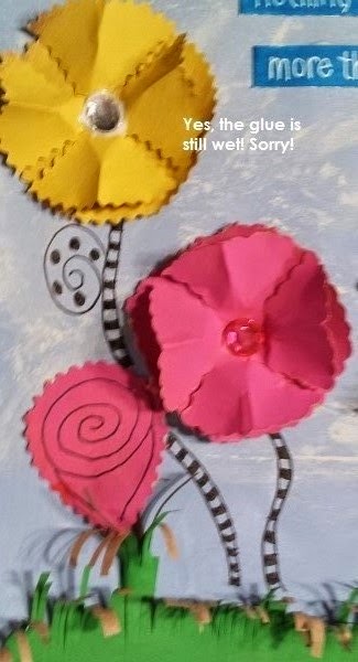
I then used straight and fancy edged scissors to cut out some circles of assorted sizes; some of which I "stripped" and "curled".  I formed these circles into flowers, added embellishments voila!  Flowers.

I cut a double strip of the green and cut a few hundred slashes onto one side.  I cut off about 1-1/4" and curled into like a tube to form a flower "base.  I cut some other ovals to make some "roses"


Assorted fancy edge scissors used


Lettering strips are 1/2" watercolor paper, colored with Peacock Blue Copic marker and lettered with White Signo Uniball


And the finished spread.  I was rather pleased with the finished outcome, giving me a little sunshine on these cloudy, rainy days.  And I did make good use of the green, right?  This way really way out of my comfort zone.  Nobody said the whole thing had to be green.....and y'all know I'm a rebel. So there.  (hehehe)


So go out there and do something outside YOUR comfort zone and be adventuresome.    Then be sure and show us your creations over at Artful Journeys!

* * * * * * * * * * * 

Here are some other things I have created recently that you may not have seen.


These ATC's were done for the prompt " Find Circles"


These ATC's were done for a prompt called "Button Day"


This is an ATC done for an Alphabet series of swaps we have going on now.  Lace was "dyed" with copic marker.


 These ATC's were for a collaboration project.  Tamie Wilson did the backgrounds, Shelly Recicar added the mesh and paper & wooden flower; and I added the sunflower girls and the saying.  This was a very fun project with a great team!


Easter-themed mail art swap with the prompt:  Easter Eggs.  The card on the right is "napkin" art that has been embellished and was included in the swap as some 'extra" love to my partners.


This is my final copy of another ATC collaboration project.  I did the background, CJ Messa added the adorable fish, rock (?) and brown sandy parts & washi, and Annmarie Killam added the bubbles and shell charms.  This was a great swap and the entire team did an awesome job!


This was made as a freestanding art piece on watercolor paper as a mail art swap. Our prompt was "HeART" art swap with Dylusions Inks, Dylusions blendable acrylics, stencils, washi, punch cuts, Staz-On stamp pad ink in Tuxedo Black and Adirondack Stamp pad ink in Stained glass.


I don't know if I showed you this one already or not, but I like how it turned out so much I'm showing it off again.  This was for a journal page swap with the prompt "Gratitude" and went to the multi-talented Delores Miller.  Dylusions spray inks, stained french lace, Vintage lady from The Graphics Fairy, colored with NeoColor II.


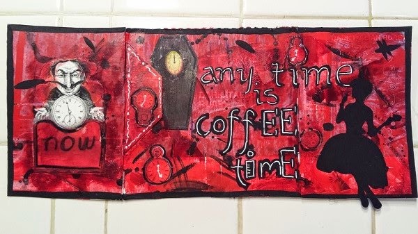
This is a tri-fold tip-in for my journal I prepared for last week's prompt at Artful Journeys. Made on an upcycled K-cups box; Dylusions blendable acrylics, vintage images from Pinterest; magazine clippings and a silhouette sent to me in happy mail.

So that's what I've been up to lately.  Thanks for stopping by and having a look.

Go out there, stay creative and as always, keep it artful!

~~Betty


Saturday, February 21, 2015

ARTFUL JOURNEYS - WEEK #8 "BEAUTIFUL"


Our prompt this week at Artful Journeys is to express something you find beautiful.

Beauty can be interpreted in many ways, with many meanings. There's the outward physical beauty of something, like a spectacular sunset, tinted with the hues of a rainbow; there's the innocent beauty of a child, both physical and emotional.  There are few things more beautiful to me than a field of giant sunflowers blooming in the hot Texas sun, with their bright faces turned toward a windswept sky, standing proud and tall.  Or flowers blooming in profusion along the side of the road.  I find beauty all around me, and in the oddest kind of places.

Today, I noticed a dead, fallen tree along the side of the road, with its branches all askew that formed the most interesting, and beautiful visage.  The beauty of a simple little ladybug, perched ever so-gently on a leaf, or the emerging splendor of a butterfly from its cocoon.  A stack of empty wooden frames causes an immediate vision in my mind of the beauty that exists in the wood, and what could have existed in those frames.  As artists, we see things with a different eye, a different perspective, and we interpret these things in a million different, splendid and captivating ways.

My interpretation today is in the form of inspirational beauty.  I am totally in love with quilts. Old, worn, cherished quilts handed down from one generation to another. Or beautifully crafted new quilts, seen with the artists' eye versus those of our ancestors who created these visions of loveliness out of a sense of need, rather than as decoration or pleasure.

Created in my large Dylusions journal, I wiped on some of Dyan Reavely's new Blendable Acrylic Paint in bright sunshine yellow with an ordinary paper towel.  Nothing fancy or complicated with that.  The paint goes on as smooth as butter, and blends like a dream (I played on some previous pages!).  Next, I gathered up a bunch of quilt images that I had been saving.  I find that I am continually inspired by quilt patterns.  I love the geometric shapes, the tiny stitches, the possibilities that those shapes generate in my brain.  The images were arranged in a fashion that I found pleasing, and I applied them with Liquitex fluid gel matte medium. I got a few wrinkles, but oh well!  I finished off the page with some faux stitching with a black Sharpie marker and added a little poem about quilts and families that is one of my favorites.  I messed up the first line (and had to look it up), but the poem goes.....

A family's like a patchwork quilt, with kindness gently sewn.
Each piece is an original, with beauty of its own.
With threads of warmth and happiness
It's tightly stitched together.
To last in love, throughout the years

A family is forever.

I hope you find some inspiration in the beauty all around us that is life.  Thanks for stopping by to look at my response to our prompt this week!


Saturday, January 3, 2015

She Sings

In life, as in art, we have to express ourselves based on what resides within us, whether we are singing, painting gentle strokes with a paintbrush, or dancing like no one is watching.  I am finding that the simpler things in life truly make me the happiest.  Am I facing my own mortality? I don't know for sure, but likely, given I have lived 6 decades on this earth and do not know what the future holds or how long I shall continue to enjoy this life.  Certainly something to think about.  Something I am thinking about these days.  But this post is not about such maudlin things as that.


Creating, for me, is something I MUST do.  I have to do it.  It doesn't matter whether I'm slinging paint and glitter or whipping up something delicious in the kitchen or refinishing and saving an old piece of furniture.  All of that is creating in my world.  I move the furniture around in the house to get new perspectives.  I rehang pictures.  I move around my collectibles to new locations, making them all fresh again.


These two postcards express all of that for me.  "She sings because she has a song" sums it up quite nicely.  We create because we have to do it, feel the need to do it, to get out that "something" within us that needs to be expressed.

Both backgrounds were generously sent to me in happy mail.  The red one is embossing on cardstock that I embellished with pastel and fussy cut out an image from an old pocket calendar I had been hanging onto.  Simple, but powerful.

The blue background is lovely and the layering of paint and paper and texture is quite satisfying.  It was a much larger piece, and once I cut it to size was more in love with it than before.  Again, I fussy cut out the back of that old pocket calendar and collaged to the background.

Nothing hard or difficult about either of these pieces.  I basically turned scrap into something beautiful and powerful. Create because you have to do it.  Create because you want to do it.  Turn play papers into something and change the perspective. This is what I did.

Both these postcards will be flying to their new homes on Monday.  I hope the recipients like them as much as I do.

Friday, April 4, 2014

Spring Is In the Air

Don't you just love spring?  Everything comes alive again--the flowers blooming, the grass is growing, the birds are singing.  A rebirth of life.  And that is the subject of my spring ATC's (Artist Trading Cards) made for a swap at Artful Mail Groupies.  I love making these little miniatures. They are always challenging and fun to make and to receive.

I recently came into a goodly supply of baseball cards and enjoy altering them for our ATC swaps.  Sometimes they are more challenging than others, depending on the mediums used.

This particular set of cards was made using a scanned and printed vintage card, sized down for the ATC and then embellished with a Signo Uniball and Sakura Gelly pen.  I felt the image surely didn't need too much embellishment as it is just too cute on its own.  I hope the intended recipients enjoy them as much as I enjoyed making them.

Following along with the goodness of spring, I made the attached greeting card, also for a swap in Artful Mail Groupies.  Our challenge/theme was 'friendship" - opening up a whole world of possibilities, quotes and emotions.  What would our lives be like if we didn't have friends?  Sad, indeed.  I have certainly been blessed to have many friends in my life and have made many lasting friendships through the internet and social media.


The base card was created on 140 pound press watercolor paper using Dylusions Spray Inks, some candy wrappers, buttons and scrapbooking paper cut outs for the stems and leaves.  These were embellished with Sakura Gelly pen.  The inside sentiment was hand lettered with my new Scarlet Lime pen and Sakura Glaze pens.  I then mounted the front to white Bristol paper and used a handy-dandy corner punch to round them out.  I hope that the intended recipient enjoys it.  I had lots of fun creating this one.


Sunday, March 30, 2014

Butterflies in the Wind

 We just completed a fun swap in Artful Mail Groupies for an art swap with a Butterfly theme. I love butterflies, and flowers and all that spring represents.  A rebirth from sleep. Spring makes me feel alive and I always anticipate the blooms of spring before the heat of  our summer burns them all up. I bring home new "victims" as my husband calls them, only to repeat each spring.  But, for a while, they are glorious, full, lush and beautiful.  If my flowers survive past June 1st, it is a miracle indeed.
These two cards were made on watercolor paper with Dylusions spray inks.  The top one was sprayed dry and "dripped", while the one on the right, I used a lacy placemat as a stencil that I got in a happy mail.  Ink and doodling were made elements with Faber Castell Pitt Pen, Sakura Gelly pens, Sharpie markers and a black china marker.  When I look at these they make me happy.  Just like spring.

Thursday, March 13, 2014

MINI DRESS CHALLENGE

The mini-dresses I prepared for our mini-dress Mail Art Challenge in Artful Mail Groupies .  I love pink, so of course I wanted to use this lovely card stock that had embossed glitter on it.  What could be more girly than that?  Embellished with organza ribbons, silk flowers, Swavorski elements and metallic paint.