Friday, July 29, 2016

New Feature at Artful Journeys!

Today I am announcing a new weekly feature over at Artful Journeys called "NEW FONT FRIDAY."  You'll hear a bit more about this further on down the page.

It seems that I am routinely asked about my lettering in my journals, and how you can improve your own lettering for your art journals, your daily journals, artwork, etc.  The answer, in short is simple: practice.


I have talked about how I practice my lettering a few times here, and my first suggestion to you is to go right now, while school supplies are on sale, and invest a few cents (yes, under $1.00) in a primary lettering tablet.  The kind with the wide lines, with a dash in between the lines.  My particular favorite is the Mead Primary Journal Creative Story Tablet.  It is made similar to a composition notebook and is generally available anywhere school supplies are sold. I get mine at Wal-Mart and I stock up this time of year when school supplies are plentiful, and CHEAP.  This particular one has a drawing area at the top of each page.  You will find this type of writing tablet very helpful to align your letters and keep the proportional spacing good while practicing.   You don't have to get THIS notebook, any primary grades writing tablet or paper will do, and will help you immensely.  This particular tablet has fairly decent paper and I have had no issues using a myriad of art supplies in it. 

Why practice?  What did your Momma or Grandmother say to you?  Practice makes perfect.  It's true. You couldn't type well either until that typing teaching made you practice, and practice a lot. You couldn't dance without practice.  And you won't be able to improve your lettering and handwriting skills without practice either.

So, armed with your Big Chief tablet and your #1 pencil (just kidding, many of you won't even know what these are--I'm old, remember??) you are about to embark on a journey that will transform your journal pages and your art by adding an important tool to your already burgeoning arsenal of art supplies:  YOU!  And the ability to add beautiful lettering to your art!

Beginning today, and every subsequent Friday, we will introduce to you a new "font" suited or adaptable to hand lettering with pen, ink, paint or whatever medium you choose and are comfortable with.  At first, take it slow. Get out your primary lettering paper or tablet and a PENCIL.  Practice writing out the alphabet in the suggested "font", both upper and lower case.  Then, try it with your favorite pen.  See?  Wasn't that fun?  Comfortable with the recommended font now?  GO FOR IT!  Add a quote or a word to a journal page or a piece of art using the new "font",  then share with us. Feel free to share your practice pages, too! Feeling cocky?  Grab a dip pen. Try out that font again, repeating the alphabet, both upper and lower case.  Got a bamboo calligraphy pen? Try that.  Is it an arty font?  Grab the paint after you letter it, and tart it up. Use your Gelly pens, Tombows, Copics. Try everything.

As you repeat a line or series of lines many times, whether you are drawing a face, or practicing a specialized lettering style, your hand and your brain begin to remember the lines, the movement involved and what it takes to accomplish the task.

Let's all have fun learning some new lettering styles, and broadening our artistic horizons.  I will be playing too as often as I can to keep you inspired.   Remember, we are dealing with some serious medical issues at my house right now, so I might not have examples for you every week. But I will give it my best shot.  I know you will too!

So your very first "NEW FONT FRIDAY"  (#NFF) lettering challenge is on the group feed!   We will start with an easy one, but the challenge is that no sample lower case alpha letters are shown for this week's lettering challenge, so it will be interesting to see what you improvise for the lower case!  Have fun!  When sharing your photos for this challenge, use the hashtag #NFF so we can find your posts!

Keep it artful!

ARTY AUNTIE
Betty


Friday, April 15, 2016

Self-Reflection: The Key to Change

 Learning without reflection is a waste. Reflection without learning is dangerous. ~~ Confusious


Today, I am putting some real-life stuff out here for you as a point of encouragement for your own writing, your journaling, your inner reflection, and as something for you to think about.  I want you to know you are not alone on your quest for inner contentment, happiness and peace.

Over the course of the last several weeks, I have been reading a lot of articles of self-reflection, and the power this can have in our lives.  As most of you know, this year my personal focus (and I hope yours too) is facing some of my own self-truths and working toward a goal of true happiness within my life, and finally and at last, putting to bed some demons that have haunted me for many decades.

The key to changing anything in our lives is a positive attitude, and identification of those things we want to change.  Achieving the identification comes most powerfully and effectively through thoughtful self-reflection.

By writing in my journal every single day, I spend a lot of time on this subject. While I do not always write on some of these painful subjects, identifying areas where I feel I fall short, whether personally, professionally or just as a simple human being brings these things to the forefront of my thoughts, thus kind of forcing me to think some of these things through and find some level of peace with my past.  Many of these troubling spots I find in my own life are trigger oriented from things that occurred in my past, or conditioned responses that I know I need and want to change how I respond when one of these triggers occurs. And how do I know this?  Self-reflection.  Digging deep, sometimes way, way down there where all the boogies from my past are buried. Sometimes I cry rivers of tears when writing, and it is cathartic for me.  These issues didn't go away on their own, despite my best efforts to bury them, nor did they disappear by ignoring them or pretending they weren't there. They're there. Not going away, and certainly not improving because I haven't honestly and truly admitted their existence, and that they are a problem for me.  No more.  I am facing my own self-truths. The good, the bad and the ugly.

One article I read wanted to know what do we really see in ourselves when we look in the mirror?  Sometimes I see a grey headed, wrinkling, maturing woman and wonder where the hell did she come from and when did she get here! Other times, I see some other version of me.  One who hides her truths from herself, and others. Other times, I see my fun self, the inquisitive one who wants to experience and explore everything. But mostly I see a woman who feels sadness deep within; a woman who wants to be truly happy.  And I am working hard to find her. The real her.  I want that happy woman in my life 100% of the time, and I want to never encounter the demons of my past again.  So that means I have to address the demons.  Ignoring them isn't making them go away and I think they drag me down subconsciously, because I have not consciously let them go.  So I am working through the demons, and I feel the change. I am now a believer. A convert of sorts to the power of recognition.

Identification is the key.  I'm making and editing my list everyday (and it's a big one), and I'm tackling these things one at a time, on my own, by my grown-up self. Admitting. Facing the truths. And not ignoring.  At least maybe I can put the totality of my demons to rest once and for all.  And a lot of what I personally face involves forgiveness. A difficult thing for me sometimes is to wholly, truthfully, honestly and completely forgive and let it go.  These things all happened in the past. I cannot do a swinging thing about them now, so full forgiveness and acceptance is the key for me.  Divine guidance and the power of prayerful study of The Word has been most helpful for me personally, and knowing that without true forgiveness I will never heal from this pain.  I'm putting myself out here for you guys so you know you are not alone. We are on a special journey together, seeking our own self-truths, and finding our own inner happiness and peace.  Bonding in this special kind of way.  Being sisters in pain bonds us. Being free sisters of happiness makes us all stronger.

So dear friends, what truths do you need to face?  What do you truly see in your mirror? Just because a painful thing happened, admitting it will never make it disappear, but addressing it in the present certainly will help make our lives much more peaceful, content and happy.  I have learned (and am still learning to practice) that what happened in the past should never be allowed to control my present.  The past is over. Water under the bridge. Gone.  Why keep hanging onto it???
Friends, think seriously about something in your past that you let control your present.  Identify it in your journal. Think about it. Tell this "thing" you are NOT going to allow it to control you anymore, that you are moving on, toward the light of happiness and that you will not allow it to creep back in. Make this positive statement your mantra. Repeat it. Write it. Over and over if you have to.  And let's practice forgiveness when we need to, and let it go. Moving on to happiness.  I'm standing right beside you, cheering you on and holding your hand.


As always, I'm keeping it artful, and facing my own self-truths with you.

ARTY AUNTIE
~~Betty

If you haven't joined our writing/journaling group, hop on over to ARTFUL WRITING where you can find interesting, insighful and creative writing prompts every single day of the year!

Wednesday, February 3, 2016

29 Faces Challenge

I am participating in the 29 Faces Challenge this year, determined to force myself to be able to draw faces -- all kinds of faces.  I want to be able to draw my own whimsical faces, serious faces, faces that look like faces and be able to use them in my art journaling.  And the only way to get better at doing this -- is to practice.  So I am officially taking on this challenge with gusto, and we shall see if I improve as the month progresses.

The challenge is easy.  Create 29 faces during the 29 days of February.  There's a group for this HERE, a Facebook Page / Community HERE, and a Blog HERE.

While I just today "officially" decided to participate in this challenge, I have been hesitant to participate over the last couple of years because, well, my drawing skills are meh!  But as I said, I am practicing and hope to get better during this challenge.

I actually started "face practice" on the evening of January 27th, and I will be brave and share them all with you as I go along.  Let's all pray I get better!  I promise not to bombard you with posts, and will share again next week.  So here we go...

January 27th - pencil  -- had some trouble with the eyes, so I left them unfinished


 January 29th  - colored pencil


January 30 & 31st - Pencil and Prismacolor Pencils.  That one for the 31st is just my weird sense of humor shining through!
 
 
Official Face #1/29 February 1st
Gelatos, Stabilo All pencil


#2/29 February 2nd
Gelatos, Watercolor Pencil, Stabilo All Pencil, Pitt Pen
Still don't quite get the whole "nose" concept but I'm working on it!


That's it for now.  As with anything new, it is all about practice, practice, practice and I am DETERMINED to be able to add faces of some kind to my art.

As always, keep your world artful!

ARTY AUNTIE
~~Betty

Thursday, January 21, 2016

Dimensional Tip-In

This week at Fauxbonichi Journalers, we were given the challenge to create a "tangled" dimensional tip in for our journals or planners.  I thought this was a fun and different challenge, so I tackled it with some late-night gusto (as usual).

A butterfly was given as an example, and who doesn't like butterflies, so I just went with it.  I started with a 9x12" piece of 140# watercolor paper, then scored it directly in the middle.  I then roughly sketched the body, and the right wing and antenna, doing my best to center it.  I folded it in half, and fussy cut the whole thing out.  I wanted it to be equidistant in size, so all I had to do was draw one side and then cut... I'm not very good freehanding that kind of thing and have both sides come out the same.

I didn't really have a plan, but now with the rough shape, I dragged out some Spectrum Noir markers and started coloring here and there with some basic shapes, just to split up the color.

Following that, using a medium tipped Faber Castell Pitt pen, I outlined the body and began doing my limited tangles in the center portion of the wings and elsewhere.  Switched off to a white Uniball  Signo UM-153 pen in white and added the rest.  I painted the head, body and antennae with black heavy body acrylics.  As you can see, my doodles are just kind of random doodly marks.  I just was going for the basic idea here, not creating a masterpiece by any stretch of the imagination. 

And, oddly enough, I see I didn't finish off the left wing checkerboard.  Guess I will finish that up in a bit with a fresh cup of coffee!  hehe

When I got all finished (or so I thought), I flipped the thing over, applied some gesso and used Golden heavy body Ultramarine blue and titanium white to cover the reverse, painting only with my fingers, not caring too much of the design, but having fun playing and blending the paint and covering up the bleed-through from the alcohol markers.

 Here's the finished example just layed into my planner.   I haven't decided the best method to affix to my planner yet, but I think 1/8" ScorTape is going to be the answer, right down the center of the fold on the body.


As you can see, I got a bit of gesso on the tangled side, but we're embracing imperfection, right?


I hope you like this idea.  I may make another one for my art journal and take a little more time with it.  It was fun and as always with doing tangles and doodling, very relaxing.


Thank you for stopping by for a visit.  Go out and keep trying new things, keeping your world artful!

ARTY AUNTIE
~Betty


Friday, January 15, 2016

Careful - Your face will freeze like that!

Betty Richardson aka Arty AuntieDid your mother ever tell you this?  Mine certainly did.  Kids love to make faces. Apparently some adults do as well with all the duck face selfies I see on the web.  Never got that, nor do I understand it, and I have a niece or two I think needs to hear that old axiom -- Careful, your face will freeze like that!  Most of the time, I feel good when I can make a 'good' face for a picture.  Must less making a ducky one!


And speaking of faces, drawing or painting faces is my bane.  So much trouble with perspective, spacing, shapes, roundness.  I want to draw whimsical faces. I want to draw faces that look real. I want to include faces in my art and in my art journals.  And the good Lord knows I keep practicing (they say it does make perfect, doesn't it?).  Well, I finally did it.  I drew a face that looks like a face. Not a circle. Not comic. A face. 

Art by Nika Rouss

And I credit inspiration from Nika Rouss at Nika in Wonderland for making me actually stop and think about the construction of a face.  It has never before occurred to me to draw half a face.  But Nika posted an absolutely stunning watercolor on her page here, (along with many others) and in my art journaling group, Artful Journeys  that for whatever reason, made my lightbulb go off.  I get so few of these moments, I had to act upon it immediately.  Isn't she just gorgeous?

When I can visually see something, I can pretty well draw it, or something reasonably close to it. But if I have to make something up from memory, well, the results can be pretty disappointing.  So I called up Nika's beautiful painting on my computer screen, I got out my large Dylusions journal and turned to a page with some leftover mop up paint.  I spritzed and sprayed some assorted Dylusions sprays on top of the acrylic paint, and put down a base layer of paint, then using my TCW Flower Frenzy stencil, added some of the stencil around the page as a base layer.
 
Anxious to get underway, I grabbed a sketch pencil and did a rough face outline and started on the eye.  Now I have practiced drawing eyes over and over and over.  I can always get the right side of the face pretty well, but the left side is always a bit wonky.  (My left side is completely challenged in every way, but that's a whole other story).  So this concept of a one-sided face really appealed to me.


When I got the basic shape of the face, the first layer of my TCW Flower Frenzy stencil was really speaking to me for her hair.  As I finished up the eye, with several erasures, and finally settled on a nose shape (real, lifelike noses still elude me), I grabbed up my stencil again and this time I used Polished Jade Dylusions sprays and extended her hair over both sides of the spread. I love how the color changes on the stencil when flipped over and on top of the alcohol ink as it progresses across the page.

I finished off her eye with Caran D'Ache NeoColor II and titanium white acrylic and the face with a Stabilo All pencil and a smidgeon of Cadmium Red Light and white acrylic.

I used some advertising words found in a magazine as the quote on the page, and outlined those as well with NeoColor II in black, dark blue and lime green.


The fun part about using the Stabilo All pencil was the ability to smudge and shade using my finger.  Granted, it is far from perfect, but for me, it IS perfect.  And the TCW Flower Frenzy Stencil was just the right size and flexible enough for me to bend and shape it around as her hair.  This is the closest to a real looking face I have ever drawn.  I will keep practicing, and one of these days I might actually draw an entire face.  But for now, I'm super happy with a one sided face.  I made progress, so practice does pay!

So go out there, practice drawing ordinary, everyday things. Sketch faces. Practice those noses, eyes and lips.  One day we'll all be drawing and painting fun and exciting faces. This day was my best yet.  Show me yours!

As always, keep it artful!

ARTY AUNTIE
~Betty

Thursday, January 14, 2016

Magical Things Happen When You Keep Trying ...

That's a pretty powerful statement "Magical things happen when you keep trying..." isn't it? 

I made some magic of my own this week, and not without practice, I can assure you.  While I am not a super-skilled artist, the one thing I do have is tenacity to keep at something until I either get the hang of it or the "lightbulb" finally comes on.  As I age, I seem to get fewer and fewer lightbulb moments, so when I do get one, an extraordinary sense of accomplishment fills my soul!

Those of you that know me and my art know that "grungy" is not something I am known for, or can (could) even do with even a small sense of satisfaction.  Being a Virgo, and with OCD and a compelling sense of order takes control of my art most of the time.  Line things up. Crisp lines. A clear picture or image.  Fear of messing up a piece I've worked hard on drives me more than just adding more.  When it comes to paint, I can slap on layers and layers of the stuff without any problem. Adding ephemera and the total finish out, well, that sometimes is another issue for me entirely.

The significant magical happenings for me this week:  I made grunge, and I made it more than once! whoop! whoop!

My grungy pieces are part of a workshop currently hosted by Tammy Garcia at Daisy Yellow called Novel Approach, where we are altering a book and exploring and working with heavy body acrylics and more grungy type work.  If you are interested in checking out this terrific workshop, click HERE.


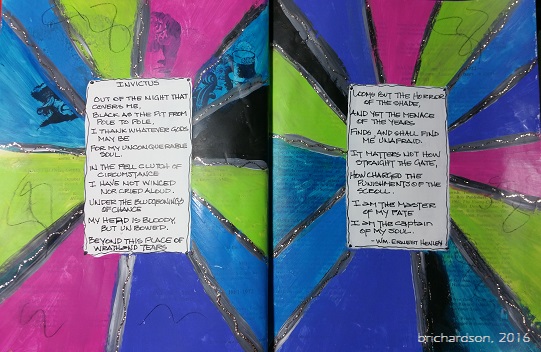
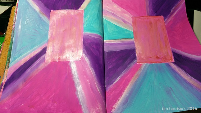
One of our first "assignments" was to create a prism or starburst page, using and blending heavy body acrylics.  This was my first page.  I shared it with the group, but truthfully, there was not one single thing I liked about it except the process.

Then, not wanting to let this thing beat me, I made a second page, this time with a little different approach and color choices.  This was page #2.  I didn't have the suggested Golden Iridescent Pearl paint, so I opted to experiment, instead, and used a soft pink Liquid Pearls and painted it on the journaling blocks and some of the lines.  Still wasn't loving it.  It was still "too" -- too bold, too bright, too "even" or something. I liked it better than the first one, but not in love with it.  Only the process made me happy.

So off I went again, on attempt #3.  I began to alter the above spread by adding some black Neocolor II and a lovely stencil by Traci Bautista from StencilGirl.


I rather liked how this looked, but then I went and added more. <sigh>  Here's where I get into trouble.  Now, I'm out of love with this one again.


I don't like my lettering (with Posca pen) and while I love this girl, I don't like her on this spread at all.  Me thinks the gesso will be coming out again to cover this one up.  Still have to either work through the ugly on this one, or start over. I decided not to decide I was so frustrated and have let it sit.

Again, I mustered up another go, brought out the gesso and slapped it over effort #1, covering up all that bright, garish ugly.  We don't have to live with something we hate in our journals. That's the beauty part about art journaling.  After letting that nasty thing sit for a day or two, I couldn't stand it any longer.  I didn't want it in my Happy Journal, because primarily it didn't make me happy. At all.


So this time, I chose a darker palette to work with.  I used Dina Wakely's heavy body acrylics in Night, Lapis and Lime. I blended with titanium white and the only brush work was the last little bit around the journaling boxes.  To me, this LOOKS grungy.  It isn't perfect. You see the movement in the paint, the old one underneath adds a bit of dimension to it.  Overall, I was very happy with this version. I still don't have anything in the journaling boxes, and might not ever put anything there, but at least I managed to accomplish the concept.

So, off I went to tackle the next grungy assignment.  Oh boy.  I got to paint more with my fingers and had no brushes to try and clean up afterwards.  This time, we were making a background page.  Gotta love those.  Here's my first one:


This is definitely NOT grungy. I got so carried away having fun blending the colors with my fingers, I ended up with something a whole lot more Monet-esque and a whole lot less on the grungy side of things.  To me, this background screams spring, butterflies and flowers, sidewalk cafes. Definitely not grunge.

So what did I do?  Out came the black NeoColor II for a few smears. Wasn't liking that all that much, so then I grabbed <hold on> ... black charcoal.  Where each paint color separation happened, I outlined the area, then smudged.  Wow, what fun was that!!  This stuff smears great.  Your fingers get super nasty, but oh what fun this was!  This definitely ended up super grungy.  I sealed the charcoal with a spray fixative, not knowing what might come later.  There is still nothing else on this page, but I think I can definitely see something kind of steampunk-y or Teesha Moore style happening ultimately on this page.  Definitely doesn't look springy any more!

You know how I am -- I still wasn't satisfied or finished playing in all that glorious, yummy paint, so I made another background page.  It's all abstract and funky and schmeary and was super fun.  I'm letting it rest a few days to see where I want to take it.  Because I was a little more heavy handed with my paints this time, not too much of the graffiti-style markings underneath with NeoColors didn't show through all that much, but I can still see a lot of the altered book through the paint, and I like that part.  It's bold and dark at the same time, and that kind of contrast really speaks to me.


So this next page, is more grungy in style and manner of application, using NeoColors and medium only, with only a teeny weeny bit of paint right at the last.  Of course I didn't exactly follow the rules or guidelines that Tammy set out, but I still was happy with the end result. It looks grungy. It appears random, although the process wasn't random at all (more of my OCD kicked in).  At the very end, I used my Stabilo All pencil and added some additional marks to my page, just because I could.  This is a huge breakthrough for me.  Just for fun. Just for play.  Just because.  I liked it!


So, by the time I finish this fun workshop with Tammy, I might just master the art of grunge.  Who knows. I'm kicking my OCD, order-loving inner critic to the curb. I'm covering up stuff I hate, and doing my best to create something that makes me happy. In my happy journal.

Life is good.  Go out and keep your world artful.

ARTY AUNTIE
~Betty


Sunday, December 13, 2015

Hi! My name is Betty, and I am addicted to journals!

My dear peeps, I have a problem.  A big problem.


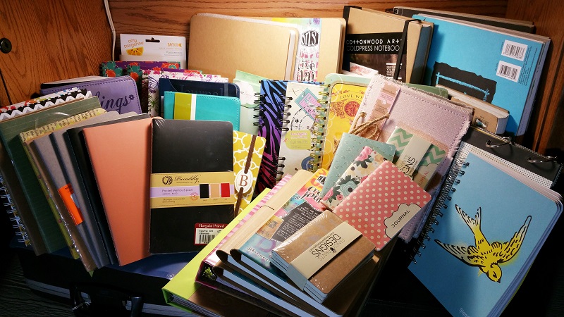
I need to join a self-help group for people like me, who are addicted to journals.  Art journals, writing journals, notebooks, Smash books, day books, pocket journals, pocket notebooks, sketch books.  Add to that art supplies of every variety known to man:  pens, paint, paper of every kind and description, doo-dads and ephemera of every shape and size, colored pencils, markers.  Yes, I need help.  But I don't HOARD them, I swear.  I use them, intend to use them, will use them.

Have I told you before that I love, love, LOVE paper? 

Passing up or passing by a stack of tantalizing new journals on display at a retailer is nearly impossible for me.  And they surely don't have to be the high dollar, latest greatest thing ever.  I have and use plenty of the very inexpensive lined spiral notebooks with foo-foo covers from the Dollar Store in a multitude of ways (recipes, swap tracking, notes, etc).  And if they are on sale or marked down, watch out, I am going to go home with at least one.  It is my belief that lurking within my mind is the subconscious and clearly irrational fear of running out of them.  As I near the end of one of my many active journals that I am arting in, writing in and fooling around with, toting in my handbag or briefcase,  I drag all the new ones out.  That's where I am right now.  I have two that will be full very soon.  Which one will be perfect? Which one is the most tantalizing at the moment?  Which will be the 'perfect' one for the next few months of writing and creating?  Do I love it enough at the moment to keep being in love with it for several months down the road?   See my dilemma?  It is so hard to choose.  I like to have choices.  It's kind of like our closets, ladies.  We must have choices.

At the moment, I am trying to decide which new "big" type journal do I want to play in next?  My 9x12"  Canson Mixed Media journal has 2 pages left to fill. it is fat and juicy and it took me nearly a year to fill it. While I love the size of the Canson, sometimes the spiral binding irritates me.  If I want to do a double page spread in it, the binding gets in my way. That takes me to my non-spiral options.  Should I use my new Square Dylusions journal (white & black pages) (not shown), start a second large Dylusions journal (I still have one in process) or select a medium-range option?   I have several from which to choose.  Is there a new one out there I don't have that would be better?  Maybe I better do a little more shopping. <wink>

I have been gifted many wonderful handcrafted journals as well. That's a whole other selection process. When to use them, how to use them, should I use them or keep saving them in "as received" condition?

Frequently, I am asked about what is my favorite journal?  The truth is, the one I'm working in at the moment is always my favorite.  Different journals, with different properties, weights, portability factors, size, and quality of the paper all determine which one is really my favorite.  And a lot of that depends on what I am using it for.

To keep up with art swaps, general notes and reminders, I generally use the el-cheapo kind from the dollar store. They are spiral bound, with hard covers, the paper is halfway decent, and their size is ideal to tuck into a purse, briefcase or tote if I need portability. They don't take up too much room at my desk. Their sizes are handy.  I have one in my kitchen that houses the recipes I use all the time ... those "go to, no brainer" recipes that are always asked for or preferred by the family.  My recipe collection in its entirety has a whole other system of binders and notebooks, but we can talk about THAT later.

For my writing and journaling, at the moment, I am in love with my Piccadilly cahier journals. I can buy them in 3-packs at Barnes and Noble and other booksellers for a very reasonable price. I can tart up the covers with paint and gesso.  I also love writing in a Moleskin cahier as well.  I love the paper, the size, the ability to tart up the covers and personalize them.  While I have a rather huge selection of other writing journals, they are still waiting in the wings to be used.  And I will use them, I promise. I have a beautiful leather bound Moleskin that was gifted to me.  I think I will be using it next when my current writing journal is full.  We'll have to see about that and what mood I am in when the Piccadilly I am currently using is nearly full.

For heavy, wet and mixed media art journal pages, I am totally enamored with the Dylusions journals, large, small, square.  The paper is outstanding. It holds up to just nearly anything you throw at it. There is no bulky binding to get in the way of double page spreads (it has sewn, lay flat binding).  It lays flat, making it very easy to work in and with. 

The Canson mixed media journals, and the Strathmore Visual Journals with spiral bindings in all sizes, are great for me for experimentation, documentation, exploration of new ideas, techniques and what-if situations.  They aren't expensive and can be replaced quickly and I never fear messing one of them up. That's the beauty about these. They take a licking and keep on ticking, just like Timex!  I am currently using a Strathmore Visual Journal, 5x8-ish size as my exploration journal.  This is where I play and can just let my artistic hair down. If I hate it when I'm through, as in most of my art journals, I can whip out some gesso and just cover it all up and create something new on top of the failed idea or project.

I have a rather small (in comparison) assortment of sketch journals or sketch books, and a couple were given to me, and a couple I purchased, with the hopes of improving my drawing skills. I have played mostly in these with ordinary #2 pencils, charcoal and assorted outline and rendering pencils. I use them to sketch ordinary things, practice shapes and the actual "quality" of the paper really has not been that important to me, since actual "drawing" is still a developing 'skill' (using that term VERY loosely at this point), but it is coming along with practice. Telling you which is these is my favorite is impossible. I like the ones where my drawings actually look like real objects. I see a progression of improvement, so that sketch book is my favorite!

So as you can see, I definitely have a problem.  The next time you see me drooling over a rack of journals or notebooks at Barnes and Noble...stop me. Make me just walk away. This will be my first step toward recovery.

Happy holidays, everyone, and may Santa bring you a new journal in your stocking!

ARTY AUNTIE
~Betty


Saturday, December 12, 2015

Artful Journeys - Week #50 "Let it Snow"

I love winter, and I love cold weather. Unfortunately, here in north Texas this is not something we get an over-abundance of to enjoy.  In fact, it was 76 degrees here on Friday, the sun was shining brightly in a beautiful, clear sky. It was more like a lovely spring day than the early onset of winter.  Weather in Texas is fickle.  Hot one day, raining the next, or we could have surprise hail, high winds, tornadoes, and yes...occasionally the rare snow fall -- but not usually until late January or early February, if at all. 

What we usually get in winter here is ICE. It rains. Temperatures plummet to below freezing overnight, sometimes as much as a 50 degree swing from the daytime.  The next morning -- disaster, but usually a holiday for everyone.  We build all our roadways here for heat -- not winter's kind of nasty precipitation.  So if it's white, hard or not, we get out in it. We play in it. We walk in it, we rejoice in the gift of winter in it's rarest and most magical form.  Roads close, schools close.  A free day is enjoyed by most everyone, because we cannot drive in it, seriously.  I'm not taking that risk.  All the Yanks that moved down here think we're crazy. They drive in it. They wreck. They go home. And play in it. 

Now I know you friends who live wayyyyy up there in the northern reaches surely have a more realistic and pragmatic approach to winter.  You can. You have the equipment to remove it, stack it, plow it, shovel it, dig out from under it. You know how to drive in it.  Nobody I know owns a snow shovel.  Who needs it?  Because by noon, any fun white stuff is usually gone and the temperatures have changed drastically.  We have mowed our lawn the week of Christmas and after that as well. 

So, if you get too much snow this winter, send us some.  But in the meantime, I'll be giggling while I'm still wearing short pants and flip flops as we open our Christmas gifts and think of you having a beautiful, white Christmas.  Keep all the hard white stuff.  Just send the fluffy, fun stuff, please.

Hopefully, you find some level of fun or inspiration with my spread this week.  I liked doing something different this year for you, and with a fun color palette.  I created the background with acrylics and vintage papers and then did an overlay with PicMonkey to finish off the spread.

Best wishes, and here's hoping all your holiday preparations are going well!

ARTY AUNTIE
~Betty

Friday, November 27, 2015

Artful Journeys - Week #48 Prompt "Hang A Wreath"


This week at Artful Journeys, we asked our members to "Hang a Wreath" in their art journals.  As usual, I wanted to be a bit different and was not thinking about "Christmas" just yet, with Thanksgiving just being barely over.  Fall is still in full swing here in north Texas, and it won't officially be winter for a while, so I didn't want to rush anything.


My initial idea was to create a 'kaleidoscope' of color, and I began by creating a wheel of fall colors with acrylics in red, orange and yellows, banded in a wheel.  I had these wonderful fall looking silk (or polyester?) leaves that I thought would be perfect. So I took out my trusty compass, drew a big circle and began to layer the leaves.  I had just enough to do a double row.  But after they were applied, the kaleidoscope really wasn't all that visible. 

Initially, I had hand lettered the quote, but must have had a brain phart right at the end, because the word "enough" was not spaced out right and looked totally stupid.  Out came the gesso, more paint, more dabbing and brushing, and lots of use of the heat gun.


I decided to pull out some new-to-me lettering stamps I bought recently and stamped out the quote on some bristol paper, cut to size and affixed with Helmar 450 Quick Dry Adhesive. This stuff is the bomb!  Really sticky, dries fast and clear and is the best general purpose adhesive I have ever used!


This spread didn't seem to need much else because to me, it was already starting to look kind of fussy with all those leaves, so I just added some doodly framing around the quote and called it good.

Below are a few other things I have been working on the last week or so. It was so nice of you to stop by for a look, and as always, if you'd care to leave me a comment on anything I've posted here, it would be greatly appreciated!


Vintage newspaper collage spread
Vintage newspaper advertising

Dylusions Spray Inks with acrylics and Stencil Girl Stencil

Dylusions spray inks and Stencil Girl stencil

Dylusions spray ink, blending tool, mop up inks and Stencil Girl stencil

Acrylics, Art doll by Annmarie Killam, stencil

Just trying to add more and make it into something!

Planner pages in the Hobonichi or "Fauxbonichi" style


Grumpy Cat "You'd be angry too if you had to wear this ugly-assed collar all day!"

4x6 index card - Repeating Word, Doodles

Artist Trading Card Swap - Crazy Birds

Impromptu Art Challenge

Thanks again for stopping by!  Remember, keep it artful!

ARTY AUNTIE
~~Betty


Saturday, November 21, 2015

I Just HAD to do it......I'm FED UP!!

Today was a beautiful, sunny day in north Texas. The sky was blue. The birds were singing. The line at the post office was horribly long, but the clerk was nice and left me in a good mood with her pleasantries.  So I toodled on down the road to my favorite Starbucks for a "reward."  I had, after all, managed to get my errands done, made it to my nail appointment, was ready for dinner in a few hours and I am on Day #5 of my "no profanity" challenge with only a couple little slip ups during the week when on the phone with my bestie.  (Does that REALLY count?)

My reward?  A delicious Triple Venti Caramel Macchiato, with no foam (yuk--hate the foam thing).  And out the window it comes in a pretty RED CUP.  The clerk and I chatted briefly, made a reference to the hub-bub lately on Facebook about it and off I drove, happy as a clam.

----------spoiler alert!!!!!!!  We're going to talk about THE CUP.  If you are offended by paper products, read no further!  While I have NEVER in the past delved into the world of popular or unpopular opinion on any subject on social media, I feel this "situation" needs more words. Some of my words.  Maybe some snarky words. So be prepared :::::::::::::::::::::::::::


And you know what, as I was driving down the road, holding my hot, delicious coffee in my left hand, I looked over at driver stopped next to me at the light.  I got a "thumbs up."  I waved and drove off, quite happy with myself.  It sort of happened again as I was approaching the light at main street...this time a big smile, "pointing" towards my cup, and a big wave.  I'm thinking -- oh Lordy.  It's the cup.

So I looked at the now-infamous red cup.  Totally innocuous.  Paper. Red. Green logo.  Same old standard kraft sleeve with some snowflake effects. No offensive words.  Dang this coffee tastes good. 

I continued my 25 minute drive back to my town, enjoying myself, the day, singing to the radio, looking at the countryside around me.  I had polished off my delicious and expertly prepared cup of joe reward in no time and was wishing for another.

After arriving home, I sat the cup on my desk. I looked at it.  I wasn't offended by it.  Clearly the two people who attracted my attention on the road weren't offended by it. The hubs didn't even notice, but that didn't surprise me.  I tarted up the cup with a cute little Christmas tag sent to me by a sweet friend in some happy mail.  The cup still wasn't offended.  I surely wasn't offended.  Who is offended by a red cup?  I gave the cup a place of honor (at least temporarily) on top of a shelf on my desk so I could look at it, size it up. Determine WHAT was so offensive.

I called a friend of mine who is Muslim.  She does NOT celebrate the Christian holiday of Christmas. I texted her a picture of THE CUP, all tarted up. She wasn't offended, in fact, she liked it.  She was jokingly coveting what had been IN the cup.  I asked her if she had paid any attention to all the social media hub-bub.  She said she had not, saying, "It's just a cup."  I asked her if a plain red cup in any way offended her sensibilities or her right to practice her own religion. She said no.  I asked her if she thought Starbucks was being "too forward" by serving their drinks in a RED paper cup.  She said no. I asked her if the x-amount of Americans who DO celebrate CHRISTMAS offended her. She said no. Now mind you, people of the Muslim faith seem to be the most maligned group everywhere right now. I have no issues with anyone, of any faith, or their right to practice their beliefs, spirituality or allegiance to anyone.  I have friends of many faiths and beliefs. I value their opinions.   I asked my friend if she knew the religion or beliefs of anyone in ownership or subordinate roles at Starbucks.  She said no.  We talked about the fact that probably most of the people stirring up this madness on social media probably don't know anything about anyone at Starbucks either, from the glass ceiling on down. Just like we don't know.  Or care for that matter.  As long as they keep on making great coffee, I'm in.  My friend is in.  Our other coffee friends are in.   What they do to or with their cups doesn't affect us. Her, me, you, them, everyone.  IT'S A FREAKING CUP for goodness sakes!

POW!!!!!!   Right.  IT IS JUST A CUP!! A paper cup, in a bright red color, with white trim, and a green and white logo.   There's no slogan.  Yes, perhaps it could be considered "secular" or "Christmas-y" I suppose.  But it is still just a vessel for holding my hot, delicious coffee.  Is anyone holding Macy's or Hobby Lobby or a bazillion and one other retailers hostage for putting up Christmas / holiday decorations and Christmas trees in JULY?  No.  Is someone making a fuss anywhere that people of all religions the world over are celebrating their special days, when and how they celebrate them?  No. (well maybe).  But my point is..... this is a cup. A plain,  ordinary, everyday paper cup that happens to be red... just prior to the impending holiday of Christmas, widely accepted and practiced in the United States and elsewhere in the world.

I don't care if Starbucks decides to put my coffee in a pink, purple and polka-dotted cup, whether it has leopard prints, rainbow colors, tribal patterns, feathers or whatever symbol some group claims as their own.  It's a FREAKING RED CUP.  Do these "naysayers" ever buy RED SOLO cups to put their other beverages into?  Are they boycotting BLUE cups? 

I love my Starbucks.  The ones close to me. The ones far away from me. The ones in Seattle and all over everywhere -- as long as they are making great coffee, giving me good service, I will still be their customer.  And most of you will be too.

Stop the madness. Get over it. It's a RED cup.  Put some art on it.  It won't be offended.

Saturday, November 14, 2015

Artful Journeys - Week #46 "Empty The Pantry"

This week at Artful Journeys we asked everyone to get creative with a bag, box or label from something in their pantry, using it in a creative way in their journals.

Naturally, I picked something associated with coffee.  There are 18 loose K-cups laying on my kitchen counter right now. Seems as though I have either used or pitched out every coffee box I thought I had...I have recently been purging and re-organizing my art space and it's not like I won't get more.  <grin>

In my honest opinion, I think that mixed media artists are some of the best people at reusing, recycling, upcycling and turning trash into treasure. I took this opportunity to do some of the same for this prompt, using some of the mountains of great stuff I have saved and have been sent by my generous art friends.  I started with the Eight O'Clock Coffee box of k-cups and began mulling over what I wanted to do while cutting the box apart.  I then cut up a really nice cardboard envelope that I received in the mail containing some stencils I ordered, prepped the backside with gesso and paint, rolled on with my soft foam brayer, using 3 colors of craft acrylic: Violet Pansy, Lavender and Diva Pink.  The gesso left bits of white showing through and I loved it!  It was messy, but in an orderly sort of way.  I cut it to 9x"x12" to fit into my Artful Journeys mixed media journal.

 Many of you know that I can add layers and layers of paint with no problems whatsoever. What I wrestle with the most is adding bits of paper and ephemera.  The concept of "JAM" -- just add more -- really doesn't work with my high sense of order and my compulsion to make everything in my life and art world the same...orderly! But I'm really working on that specific compulsion with my art.  I love, LOVE the grunge or JAM styles, but have trouble "just adding more."  So I dug out my paper ephemera container and started pulling things that spoke to me as to color, texture, re-useability.  I used a reprint of art given to me and made by Annmarie Killam, a bit of leftover painted paper received in happy mail, the inside of a Starbucks coffee sleeve, a scrap of a punch cut, some monopoly pieces and started arranging and playing.  Using my Signo Uniball 207 pen, I made some random marks on the background.  More playing around with placement of my "bits"; I fussy cut out the dolly image from Annmarie's artwork (thank you, Annmarie!) 

I decided the coffee box was too garish, so I applied some gesso with my hands and zapped it dry with the heat gun.  I am impatient, too!  When dry, I then outlined some of the letters with my Signo Uniball pen. Loved how the white gesso changed the whole look of that piece of box.


Now, time for glue and final placement.  I have recently discovered Tombow Multi Mono Liquid Glue (found it on sale at Wal Mart of all places) and this stuff is truly amazing.  It has a pen tip and a wide tip and is super-duper sticky and is quite versatile.  The packaging says you can adhere and then remove if you apply and let it dry thoroughly before attaching to something. For use as a permanent fixative, just apply and adhere to your base while wet. I'm going to test this "removeability" feature on some unmounted stamps and see how that works with my acrylic blocks.  The glue dries clear and is acid free and photo safe.  And the best part?  A little bit goes a long, long way!
So I got all my bits and pieces glued down and zapped again with the heat gun...the impatience thing again! 

I pulled out my Caran D'Ache NeoColor II water soluble crayons and used the turquoise, blue and back to add highlights to some of the bits and just smudged them with my fingers and some more outlining and doodly bits with the Signo Uniball pen.


One last bit of fiddling and I pronounced it finished.  This was a lot of fun, and for me, this was a good challenge, making art that was a little less orderly and "neat" and a whole lot of "just adding more.  I hope you like what I created!


Wishing each of you a wonderful week.  We know many are already beginning their Thanksgiving holiday preparations ... big cooking takes time!  But as always, make some time in each day to keep it artful!

Hugs and great art,
ARTY AUNTIE
~Betty